#MakeoverMonday is a great learning tool for anyone who participates and I’ve enjoyed the more challenging topics lately, because they result in such great work from our community. People really put in the effort when a topic is a bit heavier and requires more thought, analysis and careful visualization.
For this week Charlie chose a table from Pew Research Center, showing attitudes towards homosexuality, taking into account how important a role religion plays in the respondents’ lives.
Here is the original viz:
What works well:
- the title and subtitle are (as usual for Pew’s reports) are descriptive and clear enough for me to understand immediately what this visualization is about.
- Footnotes are helpful
What could be improved:
- While the list is explained in the subtitle, it is not very intuitive to sort the countries by the difference in acceptance of homosexuality between people for whom religion plays an important role versus those for whom religion is not part of their daily lives. Given the title, it would be more logical to sort the countries by the percentage of responses that show acceptance of homosexuality. For example, Australia has high levels of acceptance among non-religious people and fairly high levels among religious people. Straight after it comes Poland where acceptance is much much lower, and the difference between the groups of people is the same. Due to the alphabetical sort for countries with the same difference, Poland is listed lower. To me this doesn’t seem very logical.
- Who is actually interested in reading and comparing numbers in a list? Who not create a chart from this that is much easier to comprehend and is more engaging for the audience?
- The wording of each column header is confusing – it suggests that the number below relates to the importance of religion, not to the level of acceptance of homosexuality.
What I did:
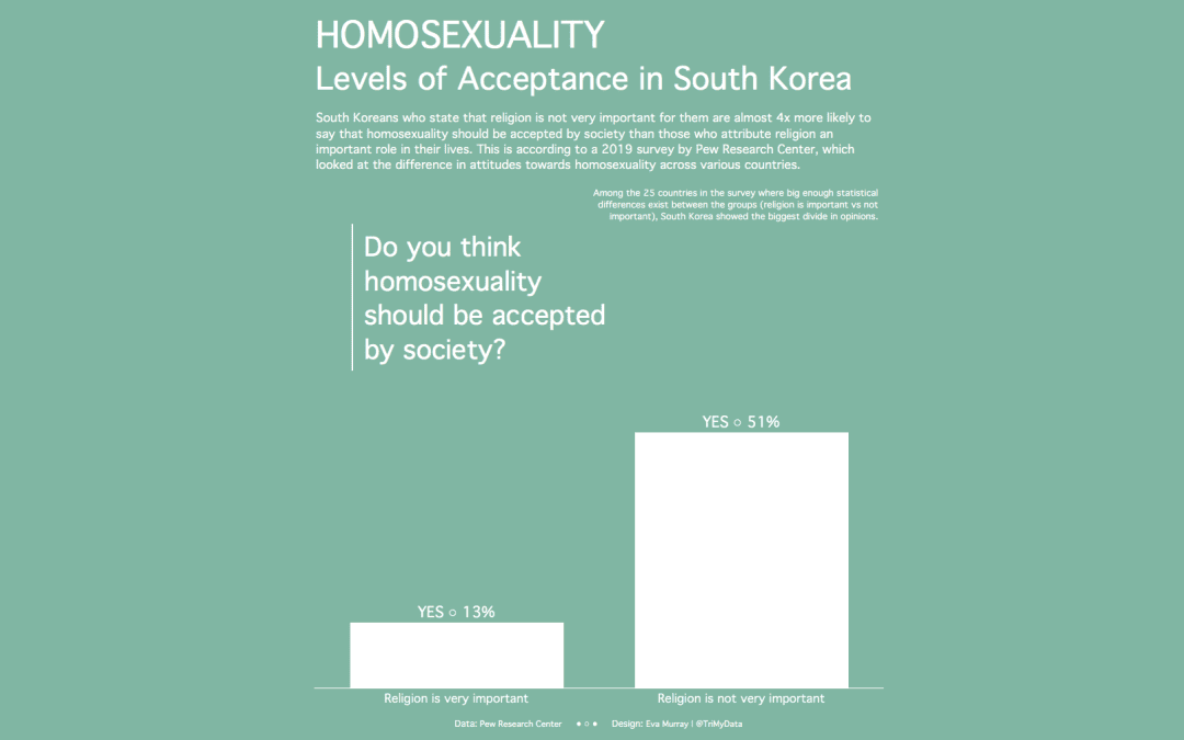
- In my visualization I wanted to address some of the shortcomings of the original. I focused mainly on the wording of the two ‘groups’ of people – religious vs non religious and tried to make it clearer that the percentage value in the data is their level of acceptance, or the degree to which they say that society should accept homosexuality.
- I was aiming for a strong blue background but the aqua shade seemed to work better.


