This week it’s time for #data20, Tableau’s virtual conference and to get everyone’s engine warmed up, we’re hosting live Makeover Monday events (Morning and Afternoon session) because we do every Monday before conference. They’re just remote this year and we’re hoping for a strong turnout from all over the world.
The topic this week is the economic output of US counties with this fantastic (sarcasm alert!) visualization from visualcapitalist:
What works well:
- I can quickly and easily recognize the map as being the US, even though the perspective is shifted.
- While I’m not at all a fan of 3D charts, the spikes do get me interested and I can identify some counties that appear to be outperforming others.
- The labels of the top 10 counties are helpful to ensure we know which one specifically is meant.
- The colors are ok.
What could be improved:
- What does this mean? What are some reference data points that help me put this information into perspective? I cannot imagine how much 1 trillion is.
- The size legend while being neat isn’t particularly useful because I can’t keep those heights easily in mind while looking across the map.
- The 3D effect makes this viz more complicated than it needs to be.
What I did:
- I played with a few different charts during the LIVE #MakeoverMonday session this morning (watch on demand here)
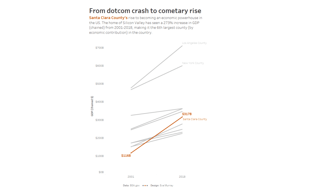
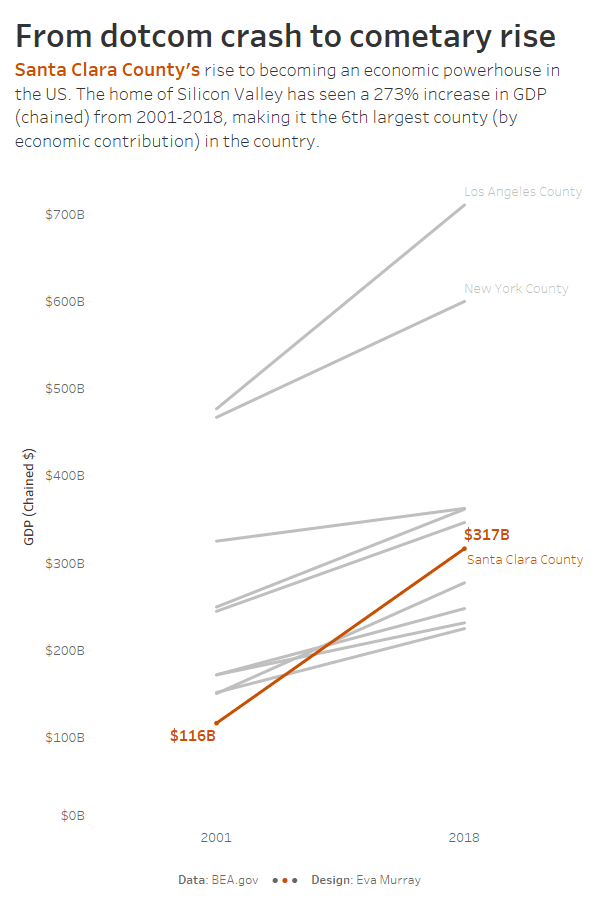
- I settled on a slope chart showing the Top 10 counties, highlighting Santa Clara and its rise over time from 2001-2018:
- click for the interactive version


