For week 41, Charlie found a whopper of a chart that is in such desperate need of a makeover. After last week’s excitement around #data20, this week should see us all relax a little and go back to business.
So here is this week’s visualization from DataIQ, who published a report looking at data assets and data culture, which included this chart about the industries of the survey respondents:
What works well:
- Nothing.
What could be improved:
- Add an actual proper title that explains what this is about.
- Use a bar chart or even a treetop (if you must) instead of this awkwardly sorted (i.e. not) circular bar chart that adds zero value. The only actual information is in the color legend.
- Go easy on the colors. There are too many colors and too many similar ones. Three shades of blue, three shades of grey, two very similar reds. Who did this???
- State data source information.
- Basically: start again.
What I did:
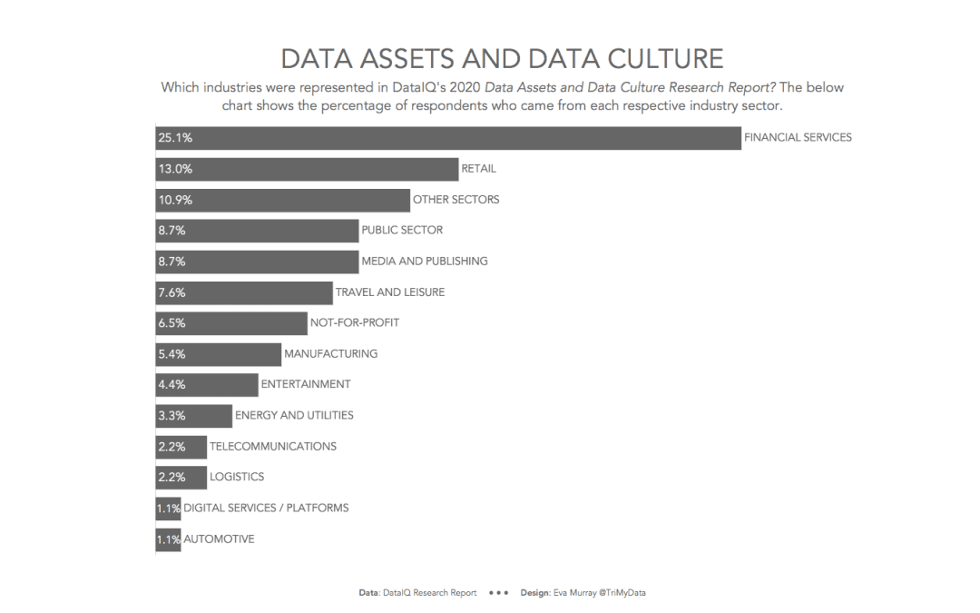
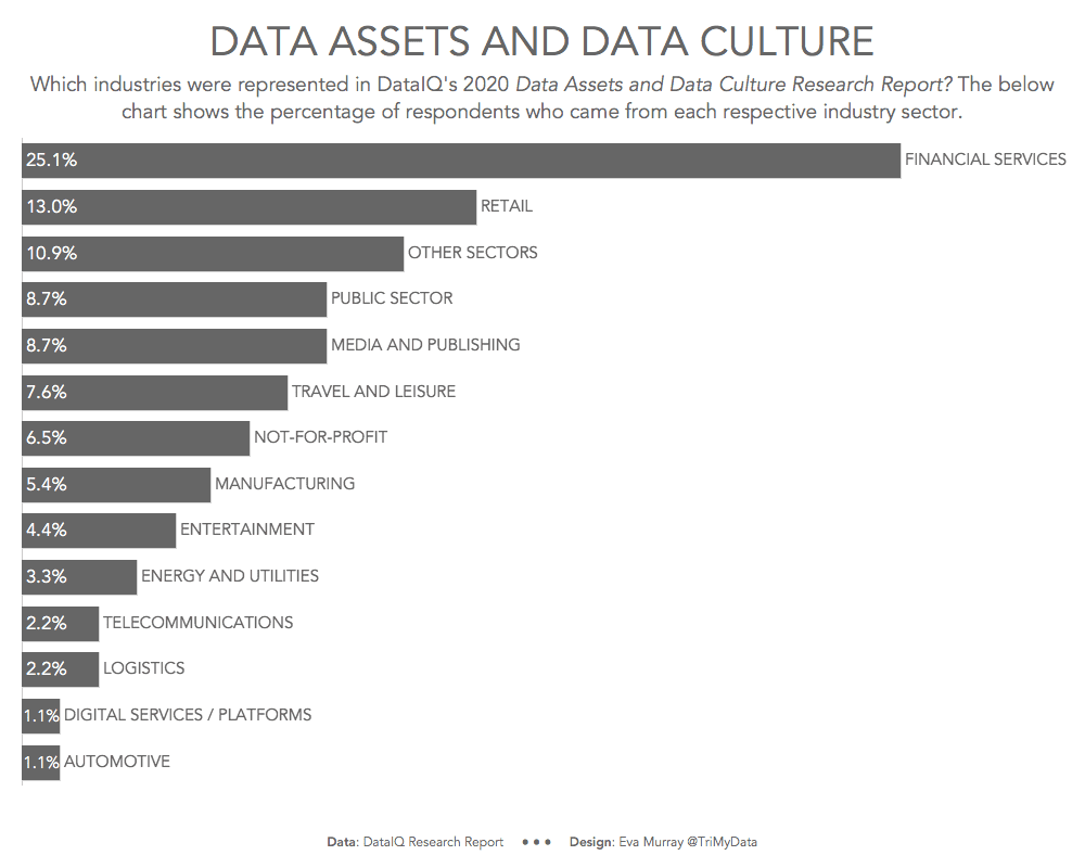
- This data lends itself perfectly to a bar chart, which is why I created the below. Nothing special about it, just a simple bar chart with labels.


