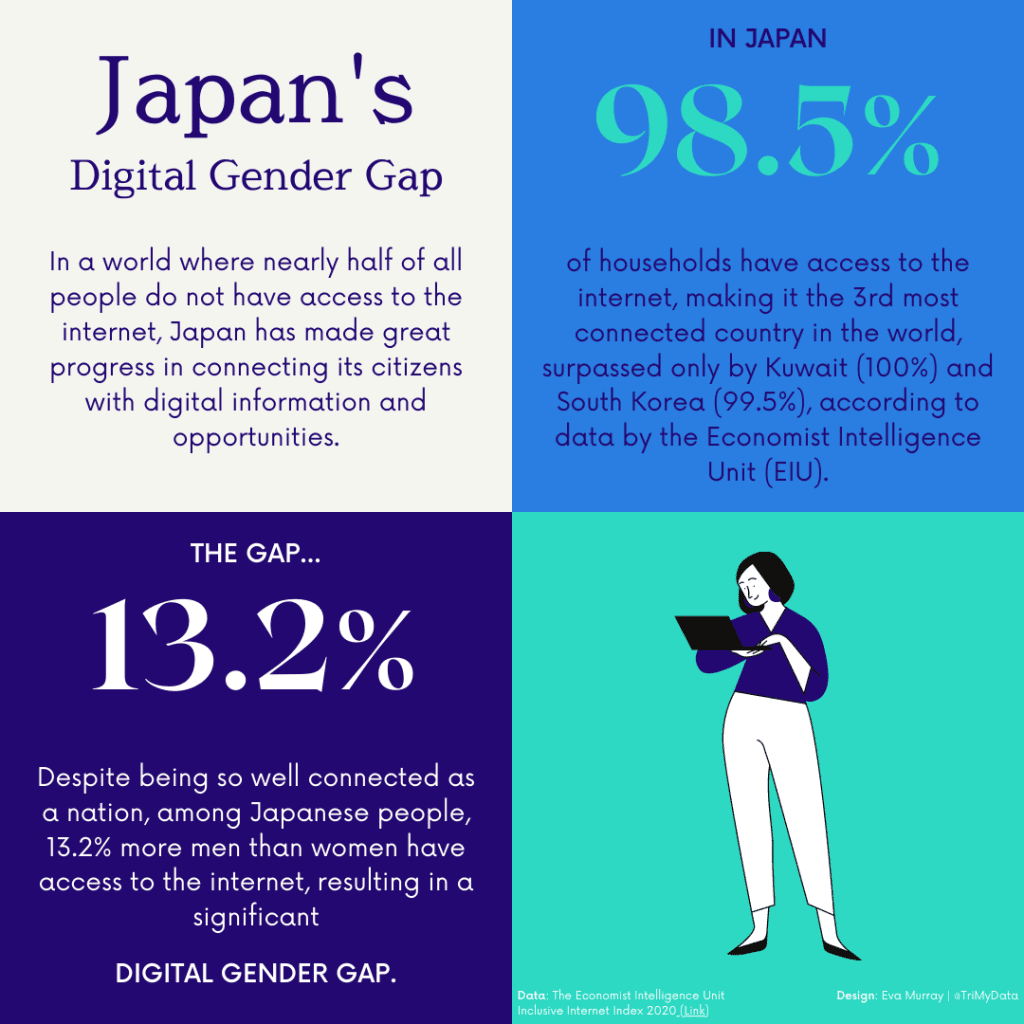
It’s time for another #Viz5 challenge and this time we’re analysing data about the digital gender gap – just how big is the difference between men and women when it comes to accessing the internet and mobile devices?
The team at Operation Fistula provided us with a detailed information package, giving us background information on the topic as well as a useful data dictionary. They also created a viz for us to makeover:
What works well:
- The title is short and gives enough information for me to get an idea of the topic
- The bar chart has a question as a title, encouraging me to think about the answer as I explore the data further.
- Countries are listed in alphabetical order
What could be improved:
- The colors are not explained – what do they mean?
- The map isn’t very helpful, because the labels make it very busy and most countries seem to be some shade of grey.
- A description of the topic and findings would be helpful, as well as an explanation of what the digital gender gap actually is.
What I did:
- I’m currently experimenting a lot with designs on Canva to start getting better skills and a better understanding of how elements work together on a page, so I did my analysis in Tableau, followed by a simple, informative visual in Canva.