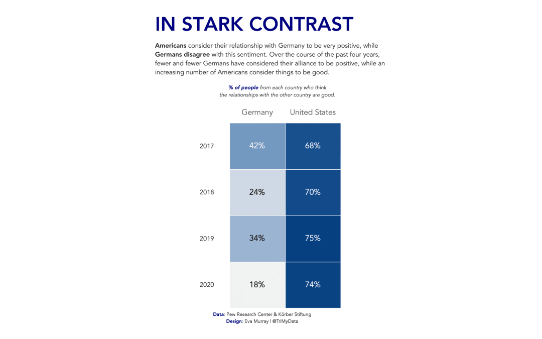
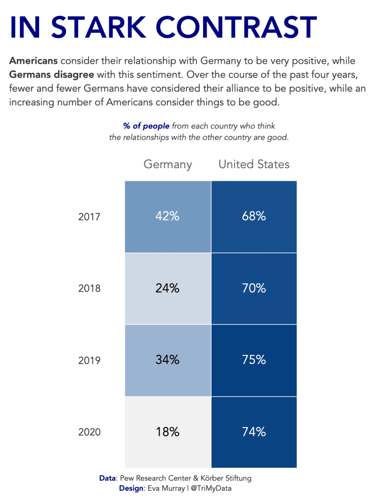
For this week Charlie picked an interesting topic: The perception among the population of how positive the relationship is between the US and Germany. The data came from a survey and the entire article can be found here.
Here is the original visualization:
What works well:
- The topic is interesting and hence the title grabs my attention
- The line charts are fairly simple
- Sources and notes are included
What could be improved:
- The wording makes it difficult for me to wrap my head around what the data is showing me
- The flags are distracting and unneccessary
What I did:
- Focused on the positive responses
- Aimed to show the change over time in a heatmap
- Tried to simplify the message while still making it very clear to understand


