We are in week 51 of 2020 (it feels more like week 175…) and this week Charlie’s ‘parting gift’ is a dataset about the performance of Andy’s favorite team: Arsenal. Suffice to say they haven’t been exactly successful this season and I have heard Andy’s view on why that is.
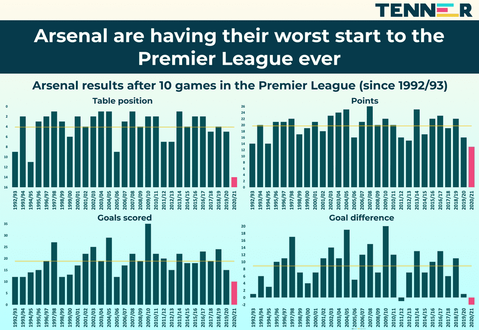
This week, so close to Christmas, and after having my travel bans completely crushed, thrown into the air and reassembled, I needed a quick makeover. Let’s look at the original visualization first:

What works well:
- The title is clear and gives me a good idea what the viz will be about.
What could be improved:
- The colors. The background color gradient is unnecessary. The pink bars for the 2020/21 season are very hard to see because the dark blue bars are so dominant. What’s the yellow line for?
- Everything looks really squashed together. The entire viz needs more space.
What I did:
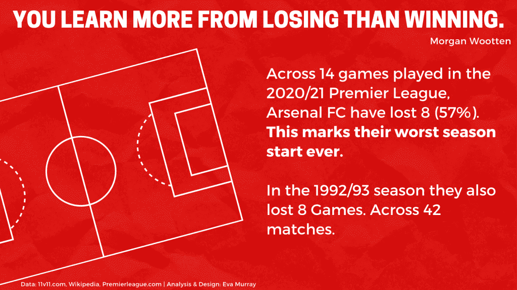
- I tinkered with the data in Tableau and found that the first season in this dataset, 1992/93 was also pretty terrible for Arsenal, so I chose to compare that year with the current season.
- Rather than looking at all the other years in between, I just picked two years to show the poor performance.
- I did the design in canva because it’s much faster to create what I wanted there, instead of Tableau.


