Finally it’s 2021 and I have to say, I am very excited about this year. 2020 was more challenging and draining than I first thought, so I’m looking ahead to a year that will hopefully be less stressful and more social.
As we turn over the calendar to 2021, we also kick off another year of #MakeoverMonday. This week’s visualization challenge is about the trail usage of people in the US, measured through observational data in outdoor areas where trails provide access to nature for people across the country.
Here is the original visualization:

What works well:
- Line charts are easy to read, so this one helps viewers to see the spike in trail usage during the early stages of the 2020 COVID crisis. It also shows that across the year trails were used more often. Potentially, as people work from home, they have more time for walking and cycling.
- The title is succinct and fairly clear.
- The axes are labelled.
- The colors work well together and make it easy to distinguish between the two years.
What could be improved:
- The title should include what they mean by ‘trail count’.
- Having the weeks rotated makes it harder to read.
- Where are the labels for the last weeks of the year?
- What’s the relevance of the number of counters?
What I did:
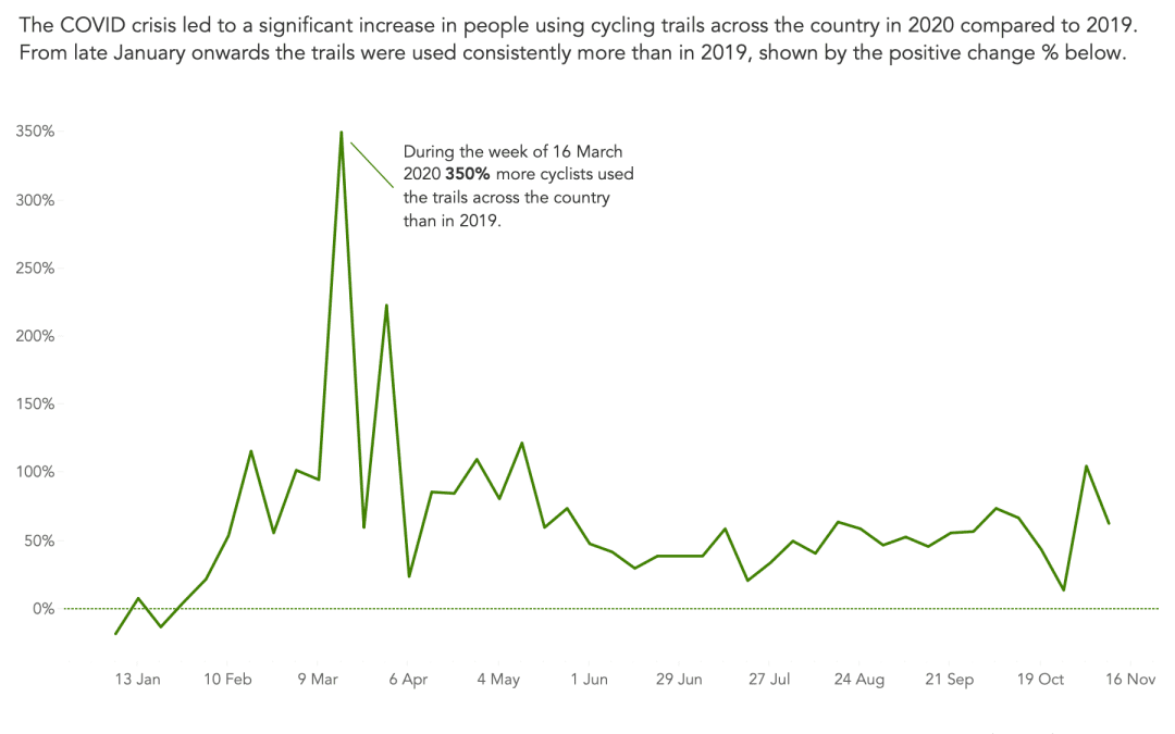
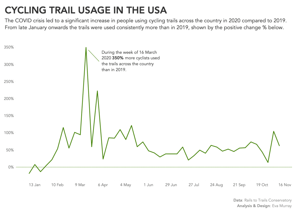
- I focused on the change for cyclists, not the total trail usage and used the change measure that was in the dataset.
- I opted for a simple line chart, annotating the most obvious spike in March to assist the reader with their understanding.


