For this week’s #MakeoverMonday challenge, Charlie chose a terrible chart that is in desperate need of a makeover.
When I say terrible, it isn’t ugly, it just does a very bad job at communicating data.
Here it is:
What works well:
- It is certainly grabbing my attention, so that is something this chart has achieved.
- Dividing up the world into regions also helps.
- The colors are pretty prominents and for the large part at least, they are easy to differentiate.
- The labels are nice and large for most countries.
- Each shape has a label.
What could be improved:
- Shapes are impossible to compare because each shape has a differen – shape… Squares, rectangles or even circles would be better than these areas
- There is too much going on.
- It’s almost impossible to read the small labels.
- So what? What is this chart trying to tell me?
What I did:
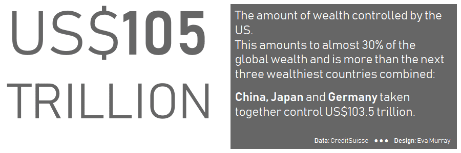
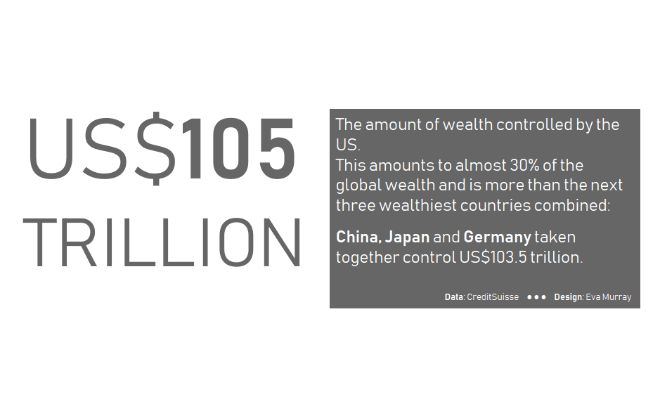
- To me the most obvious story was that about the dominance of the US.
- I opted for a Big Ass Number because the values are so outrageous that I think they tell a great story by themselves.
- So here is my super simple, monochrome viz:


