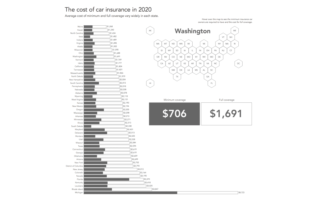
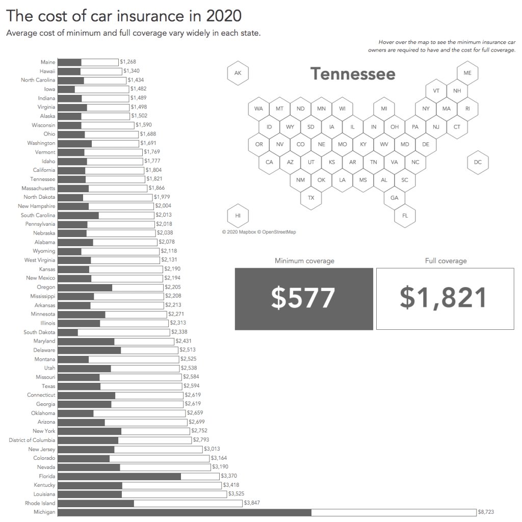
For this week’s MakeoverMonday challenge we are looking at car insurance rates – the minimum and the maximum – for each US state. There are significant differences between the states and the visualization I found that aims to show these differences is in need of a makeover.
Here it is:
What works well:
- It certainly grabs my attention thanks to the color and shape.
- The title is large and succinct with the subtitle adding enough context for me to understand what this is about.
- I can somewhat see that the states are ordered by rate.
What could be improved:
- It is unclear how to read the chart. A bit of guidance would work wonders.
- Given that this is a state by state comparison, it is too difficult to find the state name – in fact there are no names, just abbreviations. For any non-US person the abbreviations are not very meaningful except the most known states.
- The chart is much more complicated than it should be.
What I did:
- I wanted to address the shortcomings of the original while also adding a simple hex map for interactivity and filtering.
- Color-wise I’m back to monochrome.
- Added some BANs for the minimum and full coverage amounts.


