For this week’s #MakeoverMonday, Charlie picked a dataset about music industry sales in the US. I’ll admit I’m one of those people who are fairly indifferent when it comes to music. There is stuff I like and stuff I don’t like and most of my day is spent not listening to music.
Here is what the originhal viz looks like:
What works well:
- I find the overall design really appealing with the area charts and the colors, as well as the annotations.
- The dominance of CDs and the prior formats of cassettes and vinyl is very obvious.
- The axis labels are neat and fairly self-explanatory.
What could be improved:
- I’d love to know more about the why: why are revenues so much lower – is it simply because things are cheaper in the digital format or is it because music is competing with other areas of interest and people just don’t invest as much time and money into it anymore?
- It would be great to see major developments in the timeline such as the emergence of spotify, apple music, etc. There is commentary on it in the article but I think it would be great to see it all visually in one place
What I did:
- After
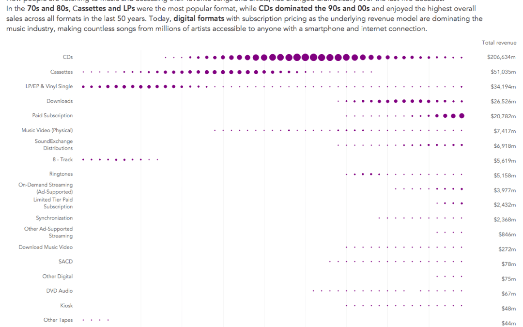
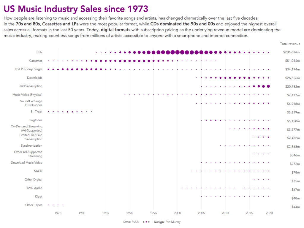
procrastinatingkeeping myself very occupied with work, tenancy applications, and training, I finally managed to work on this dataset. - I have seen many great area charts this week so opted for a simple dot plot to show when different formats were most popular.
- I’ll admit, this is very basic but my mental capacity is just focused on other life topics at the moment, so here we go:


