This week Charlie chose a viz about the eating habits of people in the UK. Plant-based foods and a plant-based diet have become more popular, with an increasing number of people also choosing to go vegan.
The below visualization is from Statista who asked people how frequently, if at all, they specifically buy and consume products that are meat alternatives or dairy substitutes in an effort to eat a meat free meal.
What works well:
- The labels for each column are helpful and the terms can probably be assumed to be self-explanatory, it is 2020 after all.
What could be improved:
- A title would be very helpful.
- A description of what we’re looking at and what the key findings are would also be great.
- I don’t understand why the y-axis goes to 125% of the population.
- The colours don’t seem to make any sense. They seem to be very arbitrarily chosen.
What I did:
- The dataset was very simple, unfortunately there was no time dimension, it would be super interesting to see how these preferences changed over time.
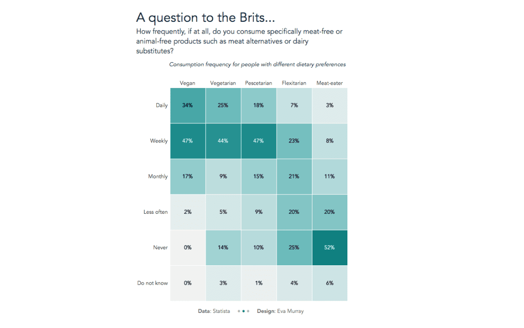
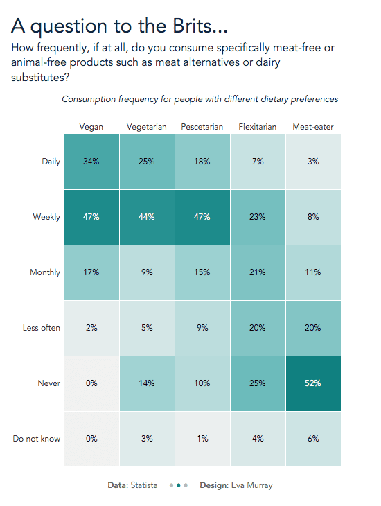
- A heat map seemed sufficient for this week, highlighting the open-minded attitude of vegans, vegetarians and pescetarians towards meat-free products.
- Here’s my viz.


