For this year’s #Viz5 (Visualize Gender Equality) initiative we get a monthly data challenge from the team at Operation Fistula. This week the topic they selected is women’s economic empowerment, with a massive dataset of 50 years of country-level data from the World Bank’s Women, Business and the Law project. The data gives us indicators of how easy it is for women to access economic opportunities across categories such as the workplace, pay, parenthood, mobility and others, compared to men seeking the same opportunities.
In most countries access for women is still more difficult, sometimes even prohibited by law. The data lets us explore the situation in different countries and regions.
Here is the original visualization which the community is tasked with improving on:
What works well:
- The map draws my attention and encourages me to explore the viz.
- The line chart is easy to comprehend (if you know what it’s about).
- There is quite a bit of detail in the visualization.
- The datasource is included.
What could be improved:
- The viz lacks context. There is no description of the topic and the dataset and what we’re actually looking at. For example, it is very important to explain the index score, how it works and what it tells us. Calling out the conclusion of the author in some form would also be helpful.
- How valuable is it to know how many answers were given to a question when there is no further explanation?
- There are too many colours and the map colours are not explained with a legend or in-text.
What I did:
- As a first step, I read the supporting documents provided by the team at Operation Fistula, because they provide a good comprehensive summary of the topic and the dataset. The data dictionary was particularly helpful for getting my head around the different fields and which ones I should include in my analysis.
- I knew pretty early on that I wanted to compare how things used to be to how they are now. I don’t see much value in showing the numbers from the 80s or 90s, unless something significant happened along the way that I could include in my analysis and findings.
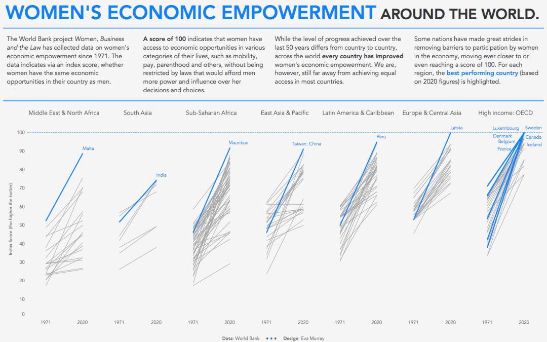
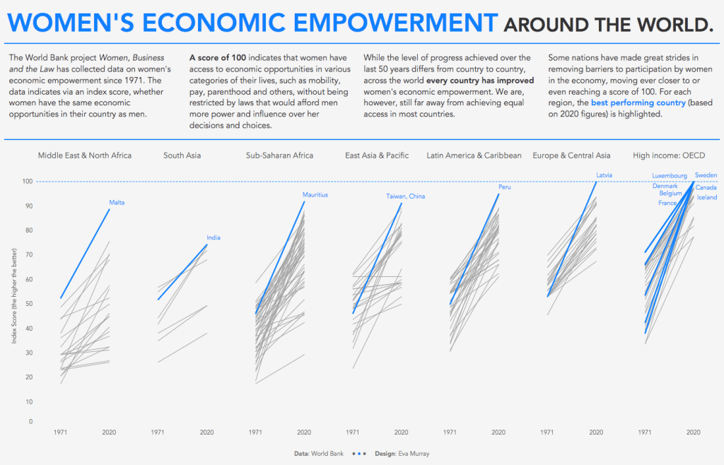
- So instead I took the first and last (most recent) year in the dataset and compared those using a slope chart. This helps us understand how much progress has been made along the way.
- I divided the visualization by region and kept the country level detail to give extra context. The best performing countries for each region are highlighted in blue and labelled.
- What I like about this viz is that it is simple but it shows the overall progress that has happened in the last 50 decades. It also shows how far away many countries still are from the 100 points index, which indicates that women face now legal barriers to economic opportunities.
- All of this does not mean that there is perfect equality in the countries that are at 100 already. There are still many injustices and the systemic society-level mindset and behaviours of people still mean that despite lack of legal barriers, many women cannot and will not pursue the same economic opportunities as men. But progress is moving in the right direction and we can all play a part in making things better.
Click the image for the interactive version


