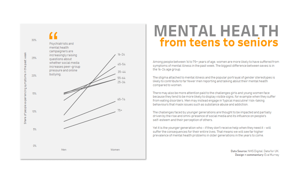
For this week’s #MakeoverMonday, Charlie chose a chart from a BBC article about the prevalence of mental health issues between men and women and across different age groups.
Here is the original viz:
What works well:
- A simple bar charts with an axis that starts at zero.
- Distinct colors that are not stereotypical but still clear.
- Title and subtitle are ok.
- Data source is included.
What could be improved:
- Both colors are quite dark, using a lighter and a darker color would help add some contrast (e.g. making the aubergine color lighter or the turquoise lighter).
- The y-axis doesn’t have a unit label. While the subtitle says proportion, the viz would be clearer if the numbers had a % symbol.
- The age groups should be specified as such. Nowhere does it mention that the data is broken down by age in addition to sex. Given that this goes out to the public, it’s best to err on the side of caution and be specific about what the number ranges relate to.
- Also, what are ‘common’ mental disorders? What is included in this data?
What I did:
- At the risk of repeating myself, I once again created a slope chart. Comparing men and women on a single metric seemed to really lend itself to this data. Plus, it shows very clearly that women have a higher rate of reported mental health symptoms (in the past week) across all age groups and this is very clearly visible in this type of chart compared to others I tried (e.g. heatmap).
- The dataset was very small and simple so my focus was on finding ways to explain the ‘why’ behind these data points and to try out a new design, which I found on pinterest.
- Find the interactive version by clicking on the image:


