For week 33, Charlie chose a dataset about Scotland, featuring a map. Here is the original viz:
What works well:
- The map grabs my attention
- The word Scotland in the title is nice and prominent and immediately tells me where in the world we are
- The labeling is helpful
What could be improved:
- My first reaction is: why should I care? There is nothing particularly insightful on this map, no explanation or compelling story (maybe there is none??)
- It’s a bit ‘much’: everything is competing for my attention
What I did:
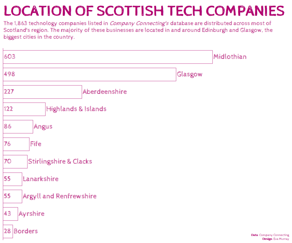
- I couldn’t quite see the need for anything more elaborate than a bar chart for this data.
- Took 2min to create and 20min to format, the usual…
- colors inspired by visitscotland.com


