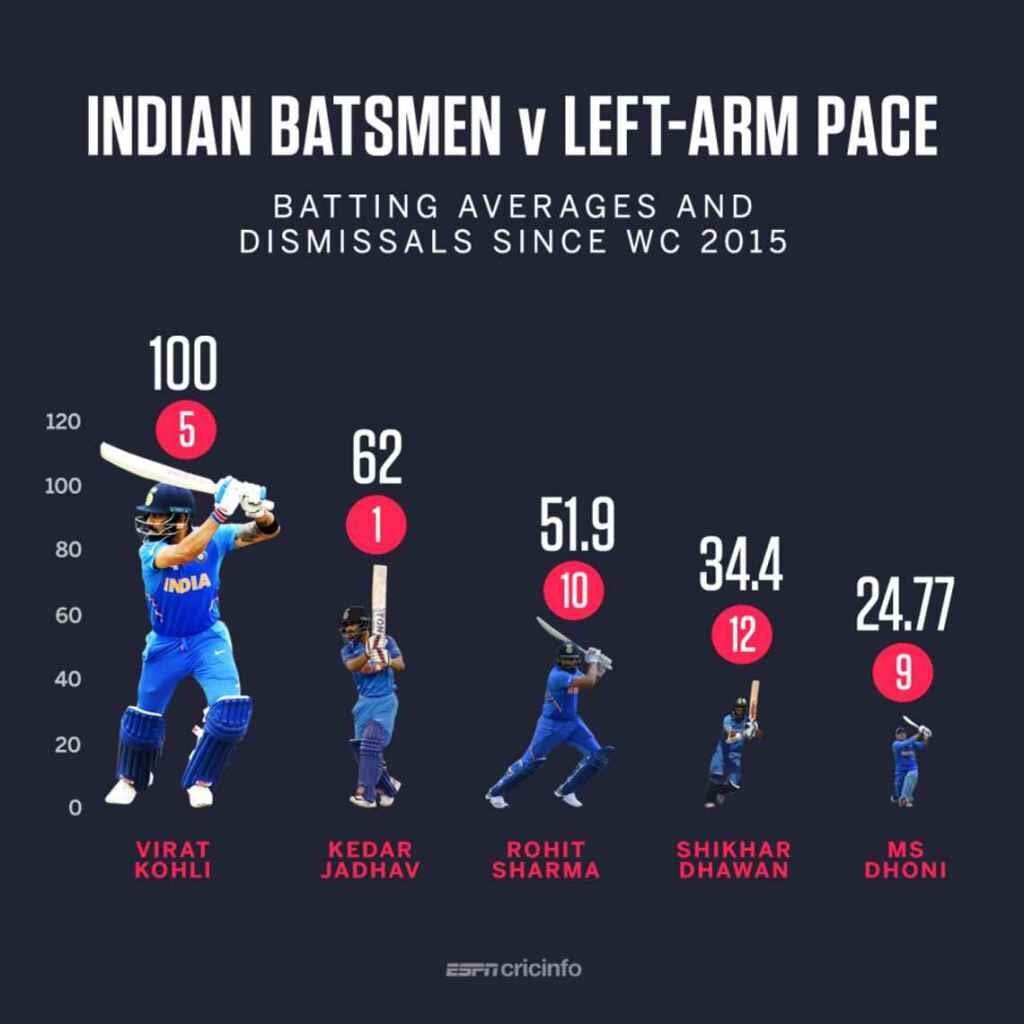
This week was all about cricket and you may as well as me to read an article in a foreign language. Cricket and me just don’t have any history and my multiple attemps to understand and enjoy the game have failed (so far). But I’m not one to shy away from the challenge. Charlie chose a very small dataset and the article wasn’t impossible to comprehend. However what I didn’t expect was the complete lack of context in the original viz, which looked like this:

What works well:
- The subtitle
- Nothing else, this is actually not a useful visualization at all
What could be improved:
- Just about everything and many people had a really good go at it in our community this week.
- Context would be helpful, as would color legends and proper bars instead of differently sized player images.
- I also want to understand how these metrics relate, which isn’t apparent.
The community created a lot of vizzes and we went through them during Viz Review. That session certainly helped me gain a better understanding of the topic and the considerations around these metrics.
Check out the recording of Viz Review here:
What I did:
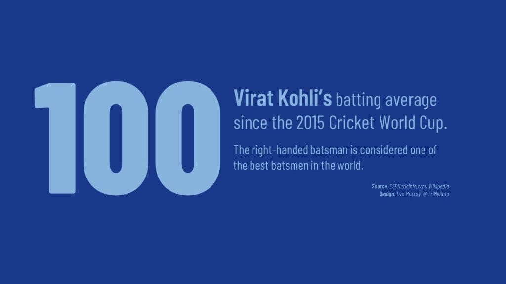
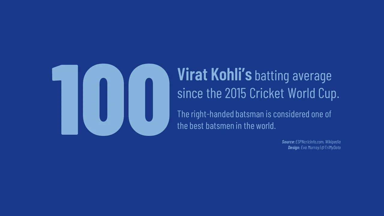
- Having seen lots of vizzes and the struggles of working with this dataset, I decided to really simplify things and to focus on one player and one number.
- I added a bit of background research (but no additional data points) and just highlighted Virat Kohli
- Colors were chosen based on the Indian Premier League logo with the light blue being lighter than the original because I needed better contrast.


