This week has to be quick because I’m official on holidays and it’s so sunny outside that it would be criminal to spend too much time in front of a screen.
Charlie selected a dataset about teacher salaries in England. I saw a lot of cool visualizations throughout the week and plenty of creativity and good analysis. Here is the original viz:
What works well:
- The title, while boring, is fairly descriptive and specific
- Each color is labeled in the legend
What could be improved:
- The chart needs a proper title
- The color legend and colored bars dominate everything, so it’s really hard to see what this is actually about
- Why are the different levels and genders all mixes in together?
- There need to be unit labels for the metric: this is in GBP
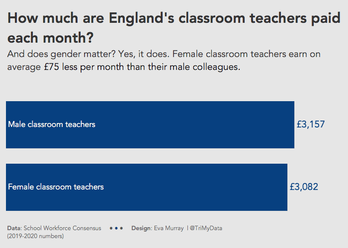
What I did:
- A quick and simple bar chart so I can go back to enjoying the sunshine and spending time with my favourite people 🙂


