This week brings a challenging topic. One that requires all of us to slow down a bit rather than rush to work with the data. Topics that are polarising and/or taboo in society give us analysts an extra bit of responsibility treat the data carefully, check our assumptions and conclusions and be mindful of the wording we use to draw attention to a topic.
For this week we shared a dataset about Protests Against Limiting Abortion Rights in Poland. This data was kindly prepared by Hania Nykowska (@hanykowska) who also created the original visualization:

What works well:
- Hania used great storytelling techniques to share the insights and troubling realities of the data in a nice visual format.
- She guides her audience through the problem step by step and uses consistent colors and formatting throughout.
What could be improved:
- I feel at times somewhat overwhelmed by information and data. I think this viz would benefit from a long-form layout and more spacing so I can take each part of it in without having so much information all at once.
- I’m not sure the title ‘This is War’ works so well for me. I understand the idea behind it but in my experience with these topics (which all come down to women’s rights to have control over their bodies, lives, decisions, thinking, etc.), there is such a massive lack of understanding and compassion from those ‘on the other side’ (e.g. anti abortion etc.), that a ‘declaration of way’ doesn’t really achieve much.
What I did:
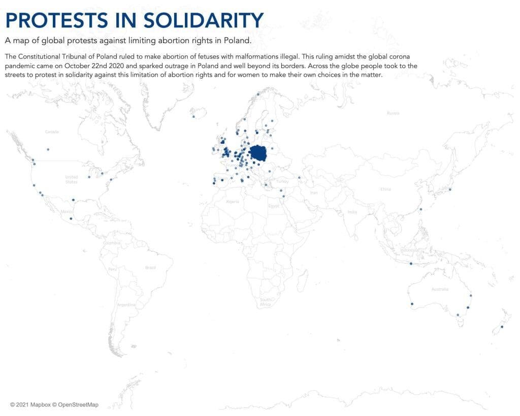
- I wanted to focus on the angle of solidarity because the data shows a great deal of support for women in Poland from people all over the world.
- I chose a simple map to show how far these protests reach.


