When our data upload day falls on Valentine’s Day, it makes for a very obvious choice of topics. So this year for #MakeoverMonday week 7 we’re looking at survey data about Valentine’s Day and the perception people have of the purpose of the day.
The original viz comes from Statista:
What works well:
- The title grabs my attention.
- The different responses are simply worded.
- The colors are clear.
- Nice simple bar chart.
What could be improved:
- The color combination of pink and blue is so sickeningly stereotypical and I hate seeing it in data visualization.
- The overall design looks very busy with the heart shaped image and the colored and branded footer.
What I did:
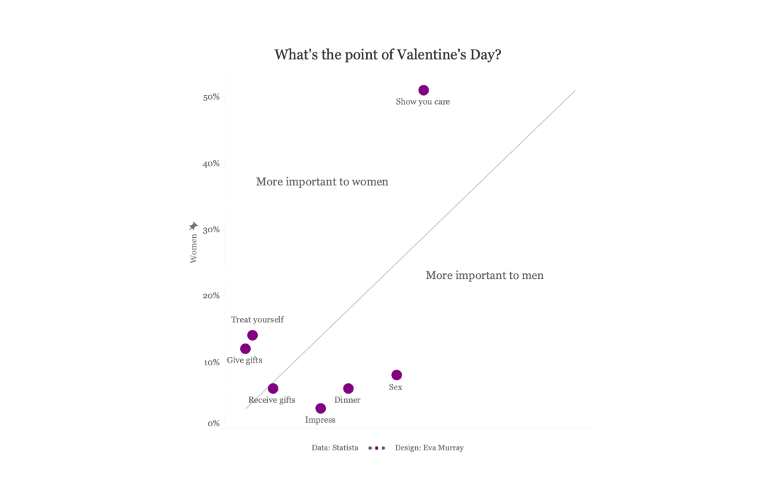
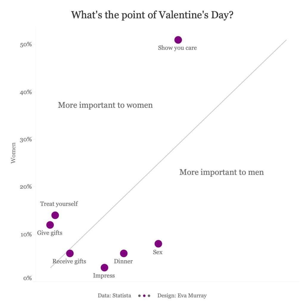
- For this dataset I created a simple scatterplot with a 45º line to show which reasons matter more to women versus men.
- Click on the image to view the interactive version on Tableau Public.


