We’re sticking with the energy theme this week and look at renewable versus fossil fuel production in EU countries.
The original visualisation comes from the EU Power Sector 2020 report from ember-climate.org:

What works well:
- The title connects well to the content of the viz.
- The renewable versus fossil fuel coloring works well and clearly shows renewables increasing and fossil fuels decreasing.
- Great labels, useful caption
What could be improved:
- As is so often the case, the story is in the report and the viz doesn’t tell the story on its own.
- There is still a long way to go when it comes to clean energy – forecasts would be interesting to include.
- I don’t understand why wind, solar and coal have their separate lines.
What I did:
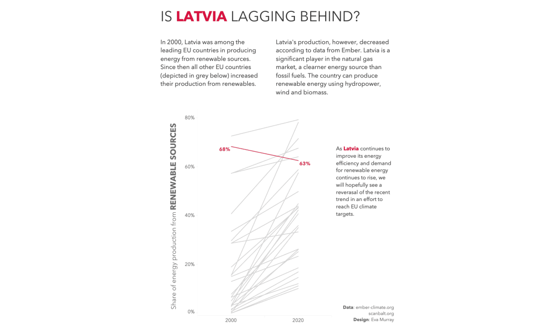
- Looking at different countries and comparing their numbers I noticed that among all EU27 countries, Latvia was the only one where production from renewables decreased since 2000, while all other countries went to increase their production from renewables.
- I decided to focus on that story.


