This year for #MakeoverMonday we made a change and now Andy is in charge of ALL the data while I’m in charge of the entire feedback process. We both get to do the things we enjoy the most and one benefit for me is that I don’t know what’s coming each week. Well, at least not until Andy gets the data ready.
I didn’t expect this dataset but it’s nice to work on a very different topic this week: Indian Coal Mine Production.
What works well:
- In the original paper, the chart has a title, which is cut off here, but somewhat helpful: District Wise Coal Production and number of mines
- The subtitle (The below graph shows large variations in the number of coal mines per district and coal production. It covers 51 coal producing districts in 13 states.) explains more about what we’re looking at.
- The colors for the two metrics are distinct and can easily be differentiated from one another.
What could be improved:
- I can’t see a logical sort order in the chart. It could be geographical, but it’s neither alphabetical nor by either of the metrics, so I find that very difficult to figure out.
- As we’re looking at output and number of mines, annotations would help make it clearer which mines are actually most productive.
What I did:
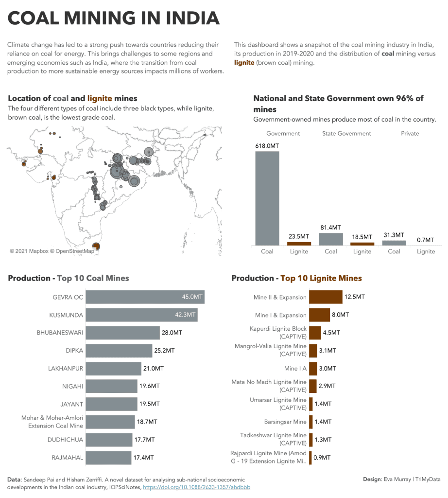
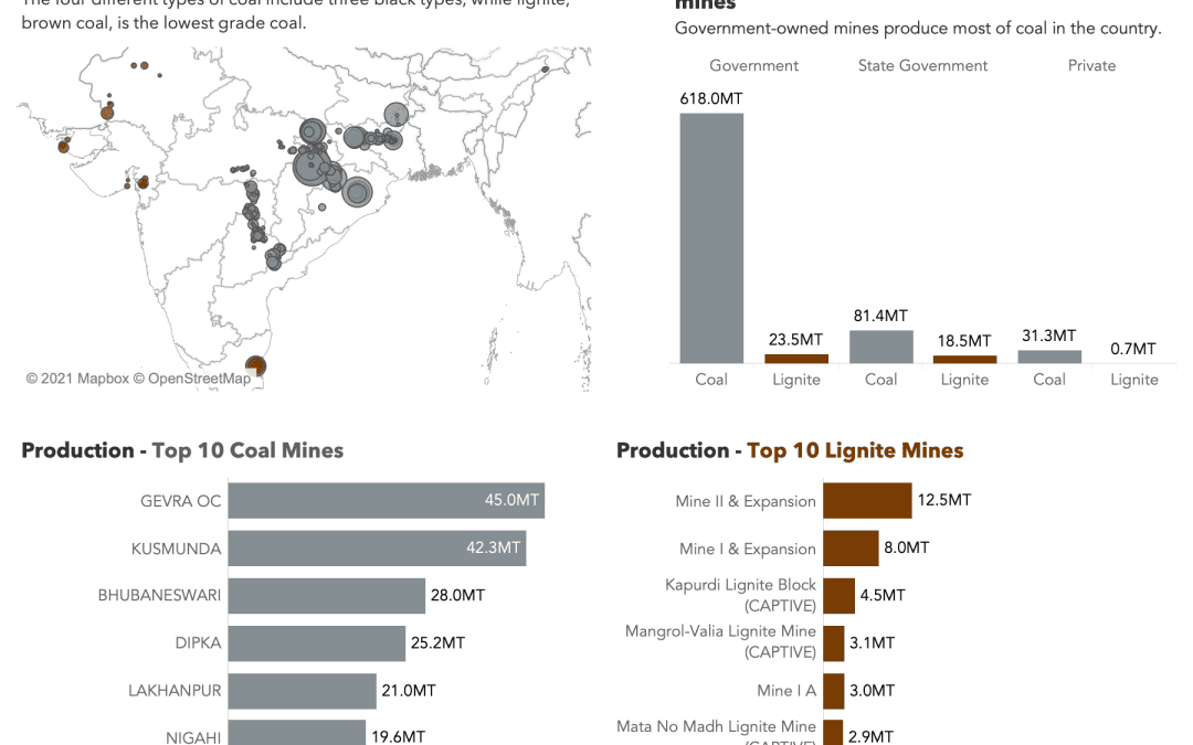
- In my visualization I created a high-level overview of the coal mining industry:
- click for the interactive version


