For this week Andy chose a dataset about global warming, a topic that has been largely ignored in the media during 2020 as everyone’s focus shifted to the COVID pandemic.
But here we are, getting closer and closer to the point where irreparable damages will be done and we still have the power to stop it.
This week’s visualization to makeover comes from Eric Roston and Blacki Migliozzi, published by Bloomberg:

What works well:
- The storytelling in the article, supported by the viz is excellent.
- The wording a graphics are simple to understand.
- The animations grab my attention and help me see a trend.
- The color choices are good and distinct.
What could be improved:
- I’m a huge fan of the interactive story told by the authors. I’d love for them to also include big world events/changes that may have impacted emissions (wars, pandemics, etc.)
- It would be helpful to have a clearer x-axis with some labels so readers can identify which points relate to their lifetime or that of their grandparents, etc.
What I did:
- As it’s already Thursday afternoon, this week was a quick viz job for me, focusing on the global figures.
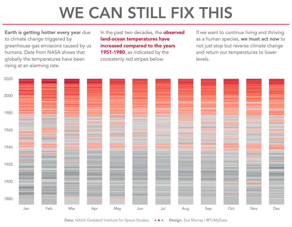
- I aimed to find a way of showing that things have gotten really bad in the past few decades and that we can aim to reduce our emissions to levels that existed in the past.
- I opted for a vertical bar chart showing months and years:


