For this week’s #MakeoverMonday, Charlie chose a dataset about the unpaid apparel orders by US brands from their producers, resulting in severe detrimental impacts on workers rights and businesses.
This is the original visualization:
What works well:
- The shaded area between the lines in each of the charts shows the magnitude of the lost value for the businesses and workers in the affected countries.
- A separate visualization for each country makes it easy to see differences.
- The tables are helpful for seeing the actual values in $millsions
What could be improved:
- The colors are garish, red with green isn’t a good idea and its really hard to look at this for any length of time.
- It’s unclear to me how to interpret the significance of this.
What I did:
- While it has taken me until Friday to actually find time for the viz, the process to build it wasn’t exactly time consuming.
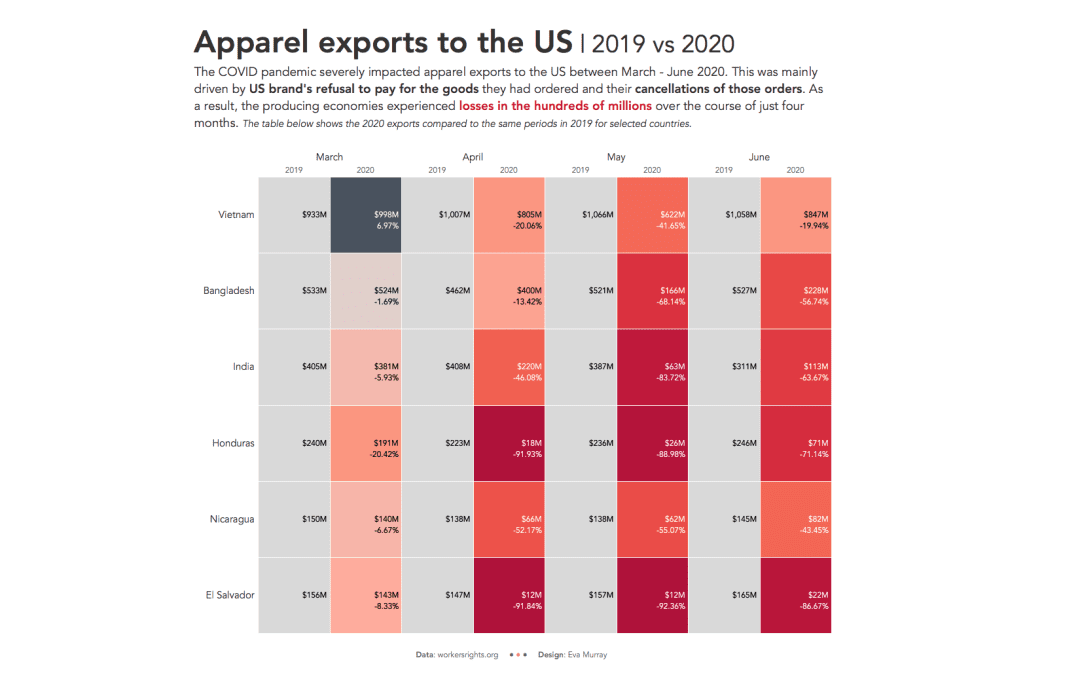
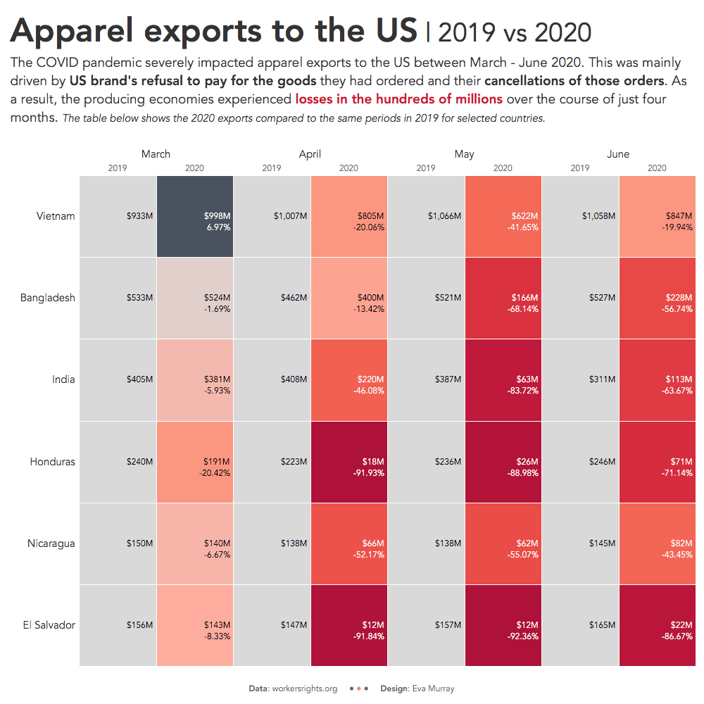
- A heat map from me this week to showcase the differences year over year
- Click for the interactive version


