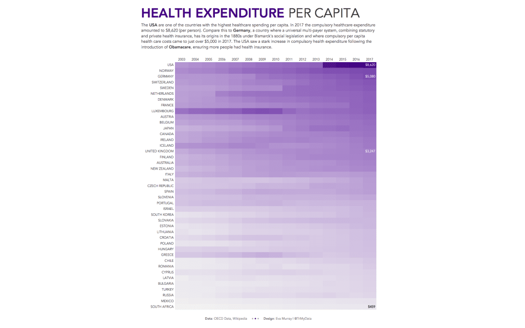
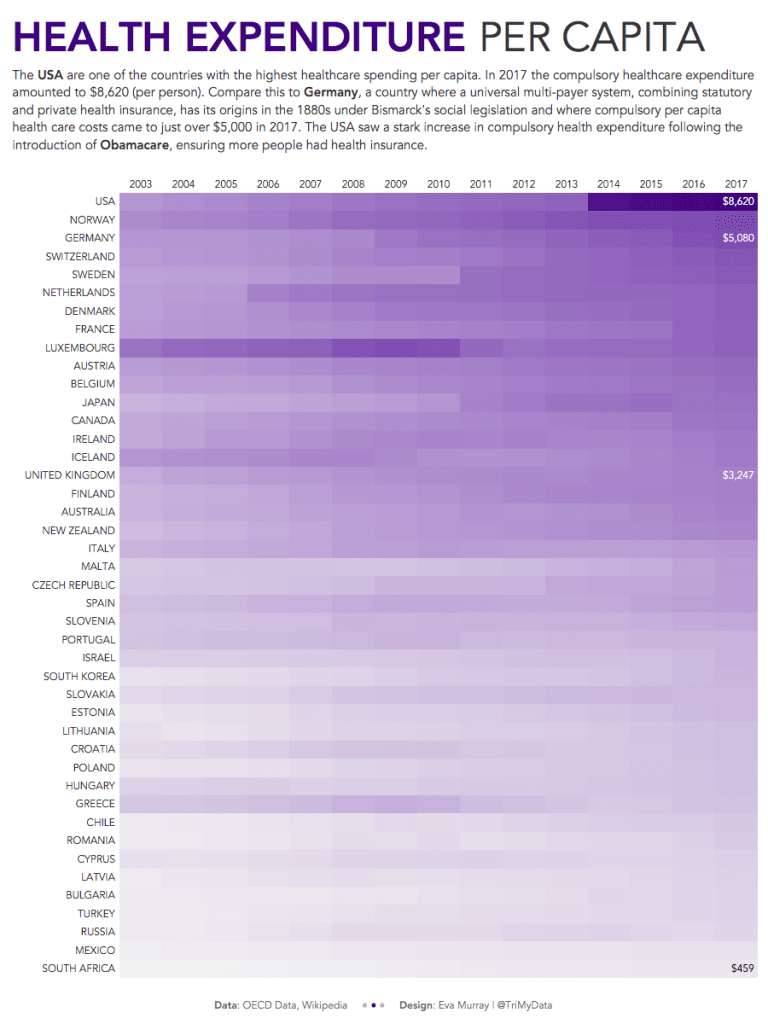
A quick viz this week and a quick blog, looking at health spending per capita in different countries. I’ll admit, I wanted to do a heat map before even looking at the data, so a heat map it is.
This week we’re looking at OECD data about healthcare expenditure and this is the original viz:
What works well:
- While I prefer horizontal labels for categorical data, the country names are easy enough to read
- Various filtering options are available and with a bit of looking at it, you can tell what’s pre-selected
- The symbols for total, compulsory and voluntary are clearly labeled
What could be improved:
- At first I thought this was data over time because it goes left to right and the close proximity of each dot almost makes it look like a line.
- It is unclear what period this data relates to
- There are a lot of buttons surrounding the viz and distracting me
What I did:
- I focused only on compulsory spending because it levels the playing field somewhat: voluntary top ups are nice but not something everyone has to do or can afford to do, so let’s look at voluntary expenses.
- I created a heat map to show a change over time but also the stark contrast between the US and all other countries that were in the dataset and had available data for the given years and indicators.
- click on the image for the interactive version


