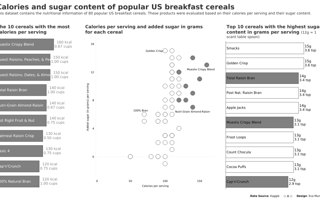
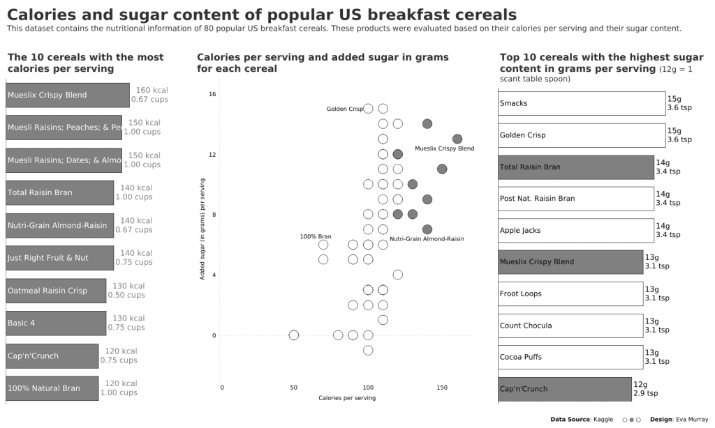
Last week I asked the community to submit datasets if they had any interesting ones in mind, especially if they came with a visualization to makeover. Michelle Frayman answered my call and sent me the dataset we’re using this week. Her two sons, Max and Sam, created a Tableau Viz that goes against all the best practices we teach during Viz Review – they did this on purpose to create a makeover viz for us. And I’m led to believe they quite enjoyed it.
Here is what they created. Make sure to follow their progress on Tableau Public

What works well:
- The titles of the charts are actually not too bad. The charts may not be easy to understand but the titles give me an idea of what we’re working with.
- The disclaimer at the bottom is very helpful 🙂
- The top ten bar chart is sorted in descending order.
What could be improved:
- There is too much colour on this dashboard, so first step would be to simplify the colours.
- The bubble chart and scatterplot are difficult to understand and need to be simplified.
- There is not a lot of contextual information about the data.
- The title has bad typos that make it almost impossible to grasp that this data is about Cereals.
- The white backgrounds of the charts on top of the overall black background is not appealing.
What I did:
- Initially I was going to explore the data and had a thought about creating a story about Oatmeal, the only actual nutritious cereal in my opinion (as everything else on this list is highly processed).
- Then I decided that given how much effort Max and Sam put into creating a viz for us, I would use their work as a starting point and create a true makeover from it to see how much I could improve on it.
- I recorded a video of myself creating the makeover. Check it out here:
Click to view on Tableau Public


