For week 34 of #MakeoverMonday, we are once again partnering with the team at Operation Fistula for a #Viz5 challenge, visualizing data about the issues impacting women and girls. This time, we’re looking at Sexual and Reproductive Health and Rights.
The original visualization looks like this:
What works well:
- The viz gives us a big picture perspective of the data
- The map shows me the regions contained in the data
- I like the coloring by region, it is helpful
- The data source is clearly stated
- There is a focus on where women’s needs are not met, which I find interesting
What could be improved:
- The title says ‘worldwide’ but the data doesn’t include every country so it’s a bit misleading
- There is a lot of detail in the table under the map. Is there a better way to visualize all that data?
- What is the story or key takeaway here? A call to action would be helpful for engaging the audience
What I did:
- After several starts and stops I got into this dataset and persisted to find the focus and the story I wanted to tell.
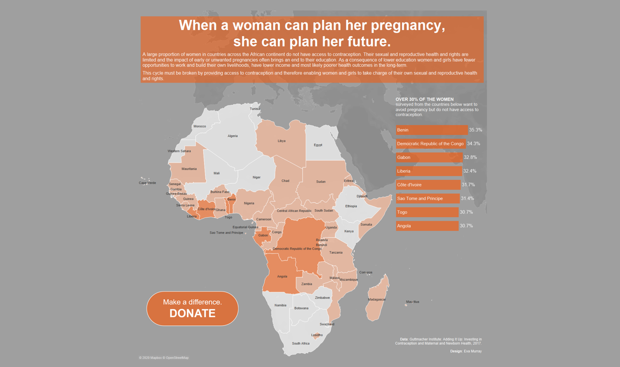
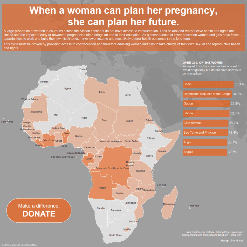
- I chose to focus just on African countries and highlight those where over 30% of women do not have the access to contraception they need.
- Here is my viz – click on the image for the interactive version


