This week sees us tackle another #Viz5 dataset, focusing on a gender equality topic: women in power, i.e. the parliamentary representation of women. The dataset comes from the World Bank and the team at Operation Fistula created a visualization for us to use as a starting point:
What works well:
- The title is succinct and states the timeframe this data relates to.
- The color choice is good: blue for positive (more representation) and red for negative is a good option.
- The two maps show distinct enough differences to be useful.
What could be improved:
- The labels on the maps make them look pretty busy/messy.
- The midpoint of the color scale isn’t clear. Should the midpoint be 50%, which indicates an equal number of women and men?
- A brief description of what ‘political representation’ means would be helpful to give context.
- Having a long list of countries isn’t that great for the user experience. Adding an option to pick a region or select specific countries and also displaying fewer countries at once would make the visual a bit ‘lighter’ and easier to comprehend.
What I did:
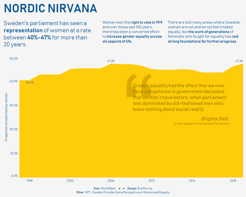
- While I love the amount of data available in global datasets, I prefer to focus on a specific detail, so for this week I chose Sweden as a country that has accomplished many milestones when it comes to gender equality.
- I did some additional research into Sweden’s progress on achieving rates of parliamentary representation that are close to 50%, without setting any quotas.
- Here is my viz: