In #MakeoverMonday we naturally mix heavier topics with some lighter and easier ones. We also aim to have a good variety of datasets so participants can work with complex, simple, large and small amounts of data, using different visualization and analysis approaches.
For this week, which is almost over, I chose soccer in the US as a topic. Life is still rather stressful with our house move 8 days from now, so the simpler I can make it for myself, the better. Hence, this dataset for which I’ve only now found the time.
Here is the original viz:
What works well:
- The vizzes from Fivethirtyeight are so sharp and clean, I really love them.
What could be improved:
- If I had to change anything about this viz, it would be the gridlines.
What could be improved:
- My original plan was to recreate the original in Tableau but Andy did that so there went my idea.
- I didn’t manage to get back to this until Thursday evening, so by then it was a matter of ‘bar chart or heatmap’.
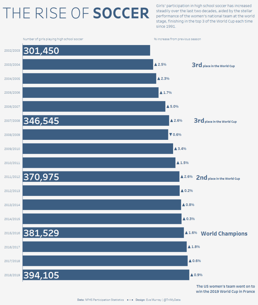
- I settled on the bar chart, focusing on girls’ participation in high school soccer:


