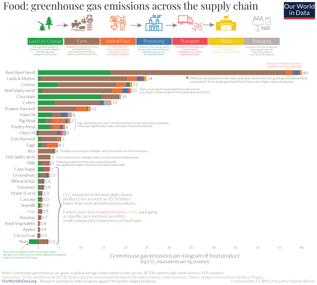
As we all eat multiple times a day, I decided to look for a visualization about food and found this one about the emissions linked to different types of foods.

It comes as part of an article about eating local versus focusing on ‘what’ to eat.
What works well:
- The title is pretty clear and simple.
- The supply chain is explained at the top, making it easier to understand how the total GHG emissions of food actually come about.
- There are a number of very helpful annotations included to clarify individual items on the chart.
- Footnotes are included for additional information.
What could be improved:
- There are a lot of different colors on the viz, making it difficult to distinguish the different stages clearly from one another, as some segments are quite small.
- it looks very busy with all the annotations. These could potentially be moved to tooltips.
- The different food categories are not very easy to identify.
What I did:
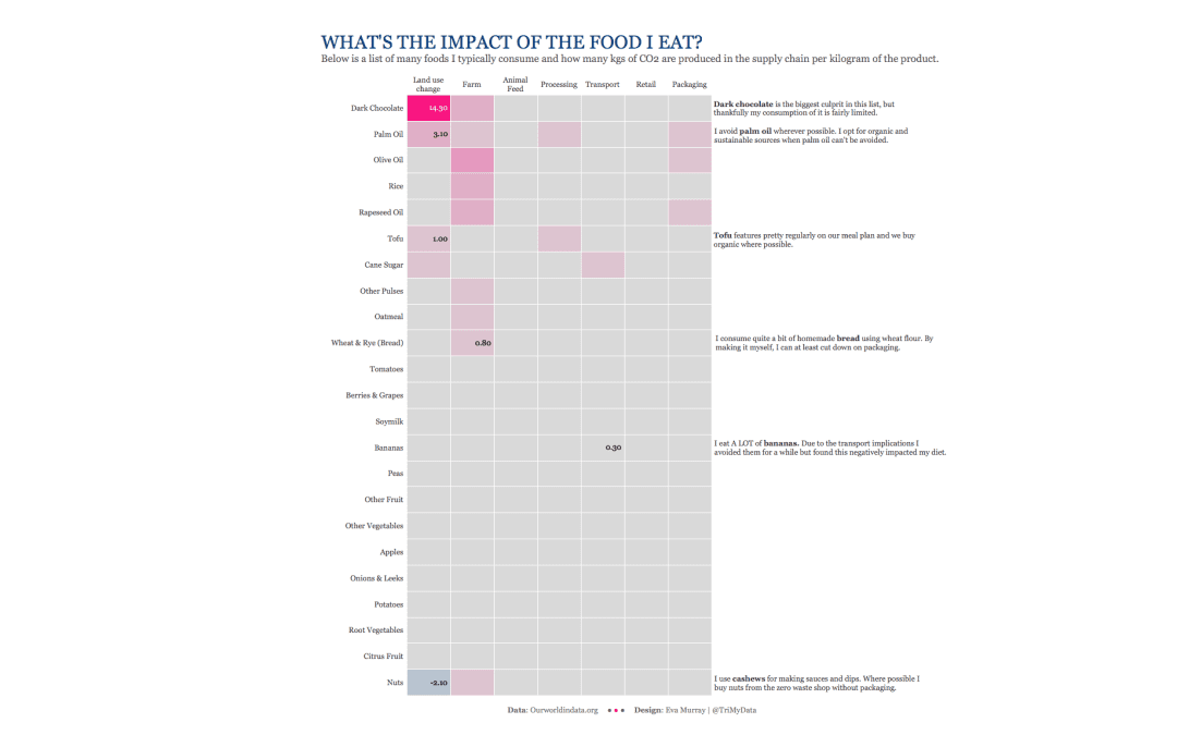
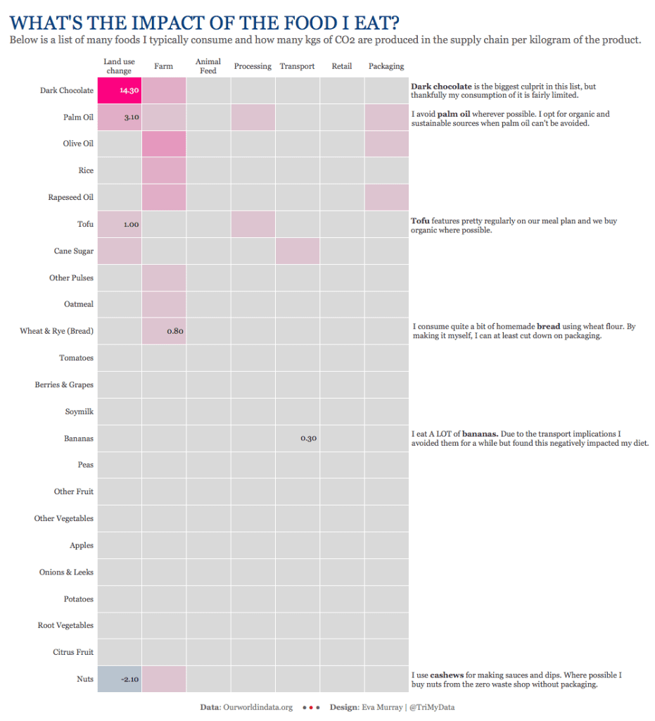
- I went for a simple heatmap, looking at the foods I eat most commonly.
- Not a design masterpiece but interesting for me to see the best and worst foods in my diets based on their GHG emissions.
- Click on the image for the interactive version


