It is another week for a Viz5 dataset as part of our collaboration with Operation Fistula.
This month, we’re looking at the topic of unpaid work, something so poignant right now that hundreds of millions of people are staying home and as such, unpaid work – often done primarily by women – will hopefully become more visible.
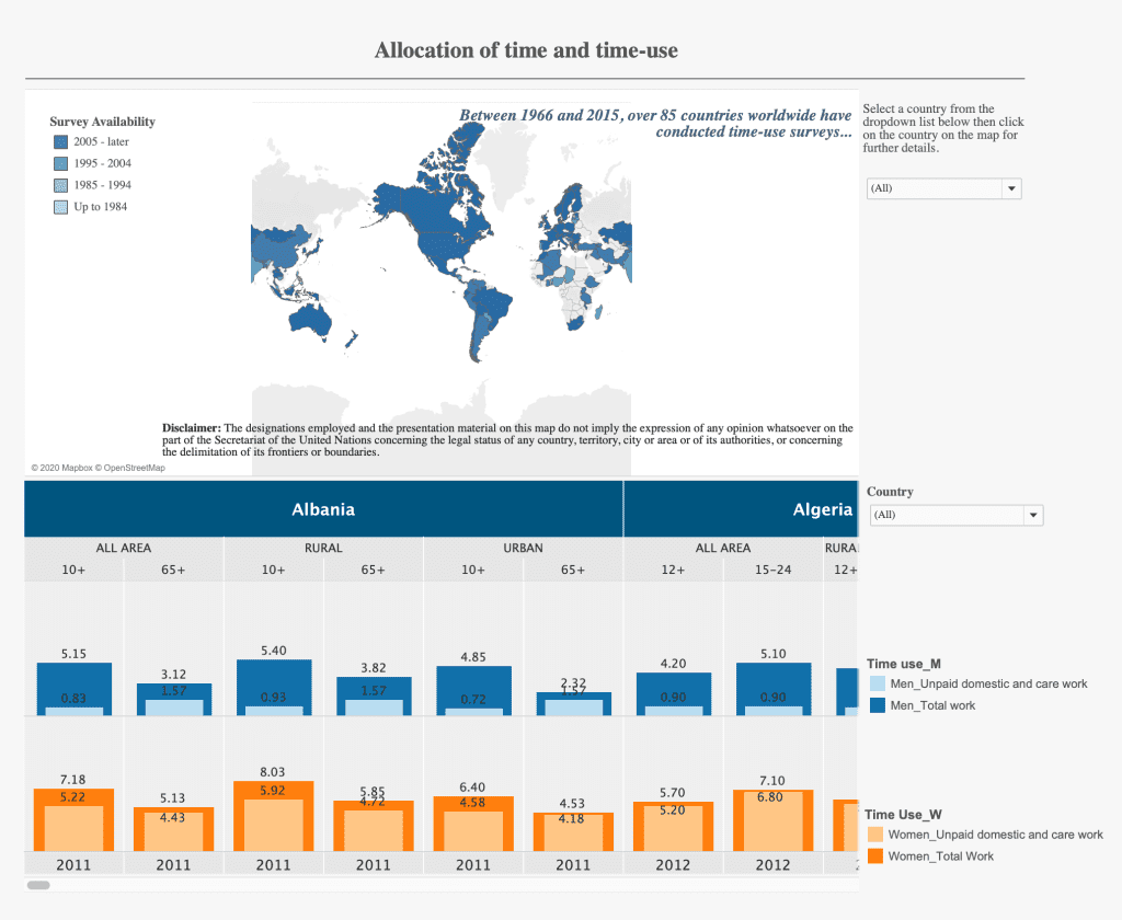
Here is the original visualization:

What works well:
- People know how to read a map and as such it will be engaging people.
- The bar in bar charts have a legend to explain them on the side, which is helpful.
- The colors are nice and simple
What could be improved:
- Color coding the map by survey availability makes no sense to me. A gradient color palette like the blue one chosen would work for a measure, such as hours of unpaid work, but using the years seems like a strange choice and I don’t understand what value the map adds.
- None of the charts are explained properly or annotated clearly to help the user understand what they are looking at.
- So what? there are no insights or ideas shared or calls to action on such an important topic.
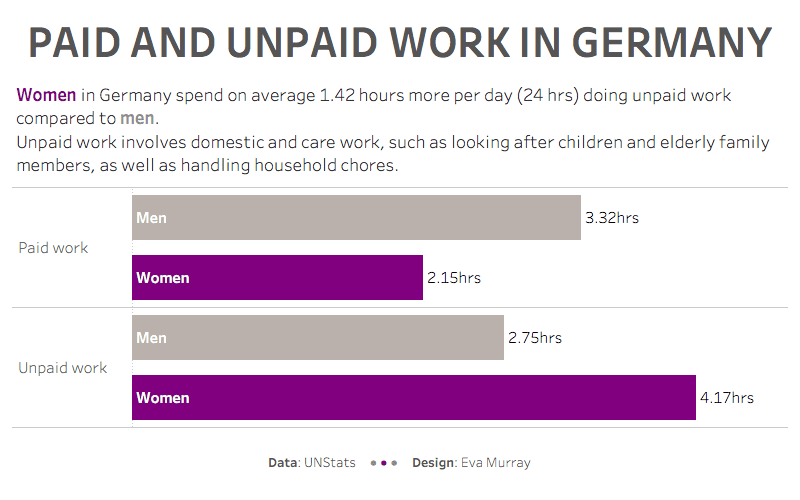
What I did:
- A quick bar chart, tackling this rather messy data:


