On a Monday morning here in London, the topic of sleep seems pretty appropriate, I have to admit, because getting enough sleep between various work and life commitments (and choices) can be a struggle.
Charlie chose the following viz for this week’s #MakeoverMonday:
What works well:
- A table, while not being visual compelling or engaging, is a pretty simple way of representing data and is understood by most people fairly quickly.
- The metrics are simple, the age groups have simple descriptions which will be understood at least by a US audience.
- The source is included.
- The sleep deficit, i.e. the part of the data that should be most important, is colored to draw attention.
What could be improved:
- Tables are not great for comparing different attributes and categories, because the reader needs to look at each value and do the math in their head to understand how numbers compare.
- Nothing in the visual looks alarming to me, not even the orange and red numbers. Given the seriousness of sleep deficits in terms of impact on students’ health etc., this visualization could do a much better job at communicating insights.
- There is no call to action or recommendation of what to do with the information.
What I did:
- Initially I planned to create a KPI dashboard, but the data was so simple that it seemed like overkill.
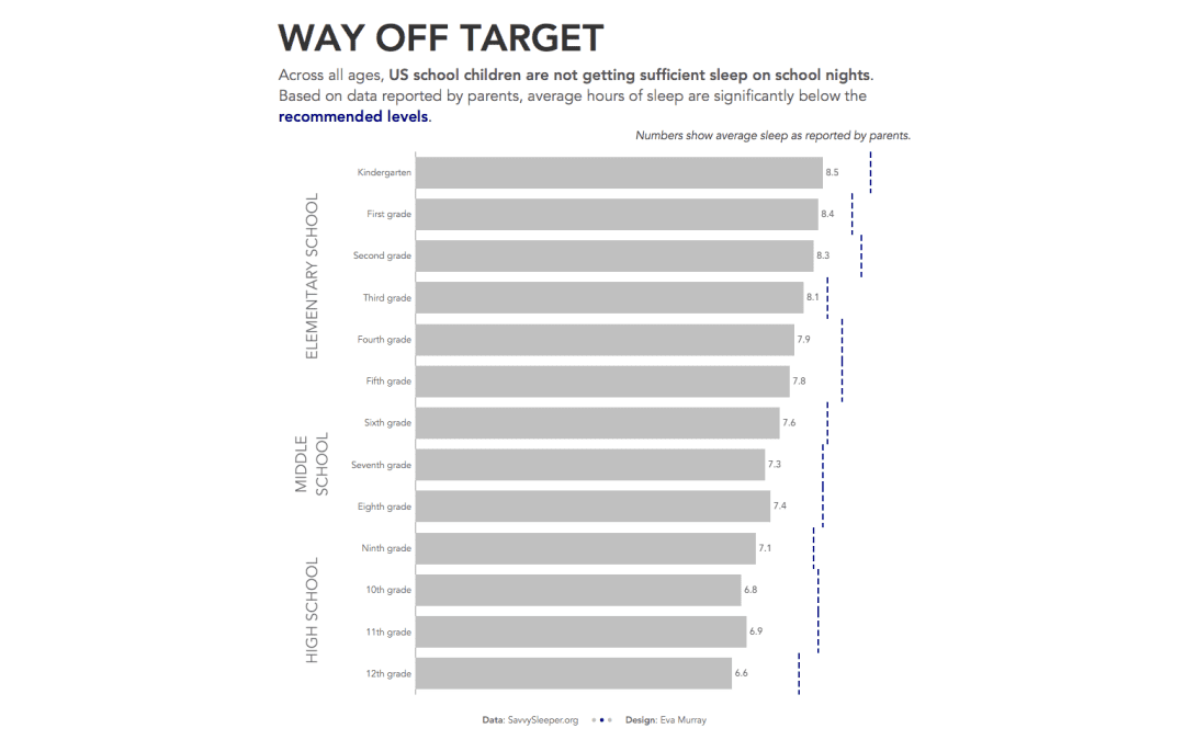
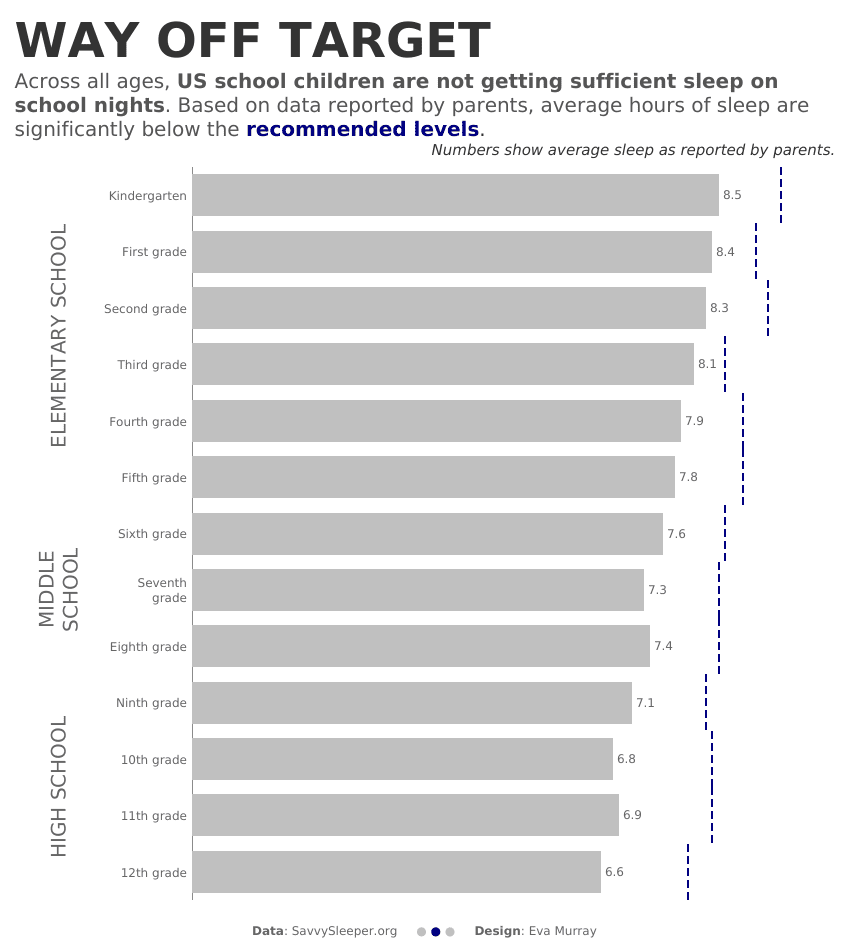
- So a bullet chart is my answer this week, showing each grade’s actual sleep versus recommended levels.
- Here is my viz for this week:


