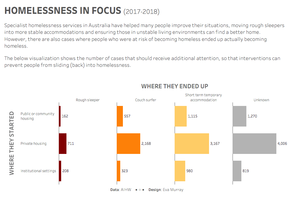
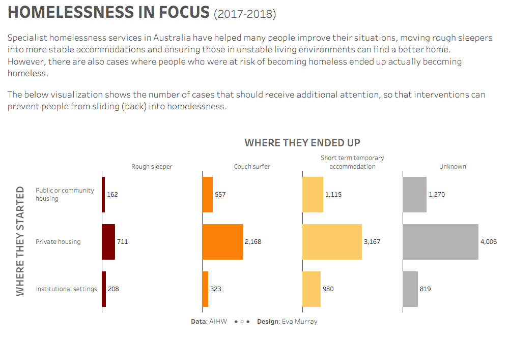
For week 8 I chose a dataset from the Australian Institute of Health and Welfare, looking at homelessness statistics and, more particularly, the outcomes of specialist homelessness services.
The original visualization was published on AIHW’s website:
What works well:
- The visual is grabbing my attention with the curved lines of the sankey and the colors used.
- I like the choice of colors, as they work well together, indicate the higher risk categories (rough sleeping, couch surfing and short-term accommodation) and indicate those categories where people are not ‘on their own’ anymore but supported by a service.
- In general, I like that the sankey shows the ‘before and after’ with the outcomes for homeless people, indicating that a lot more people are in private housing and community housing and that across all risk categories numbers have reduced over time.
What could be improved:
- Most lay people will likely need some more context to genuinely understand what is shown in the visualization.
- The subtitle describes what was done but does not clearly indicate how to read the chart or what ‘specialist homelessness services’ are.
- The interactivity (filter) seems very laggy, which makes it harder to navigate to the different views I am interested in.
- For me, the sankey diagram hides the magnitude of the challenge and also glosses over the individual cases. Yes, at the national level that is probably to be expected, but I find the visualization doesn’t really touch me on an emotional level, and there is no call to action, which is a missed opportunity given the topic.
What I did:
- This is not an easy dataset to work with, but it’s an important topic to tackle.
- I went through a few ideas and charts, trying to figure out what the message is I want to convey.
- Talking about the positive outcomes was definitely tempting but after comparing the ‘before’ and ‘after’ situations and the number of people in each of the different categories, I decided that I wanted to focus on those cases where people’s living situation got worse instead of improving, despite accessing specialist homelessness services.
- AIHW probably has an answer as to why these things happen, but I figured it’s the most obvious one for me to call out, so here is my viz (click for the interactive version):


