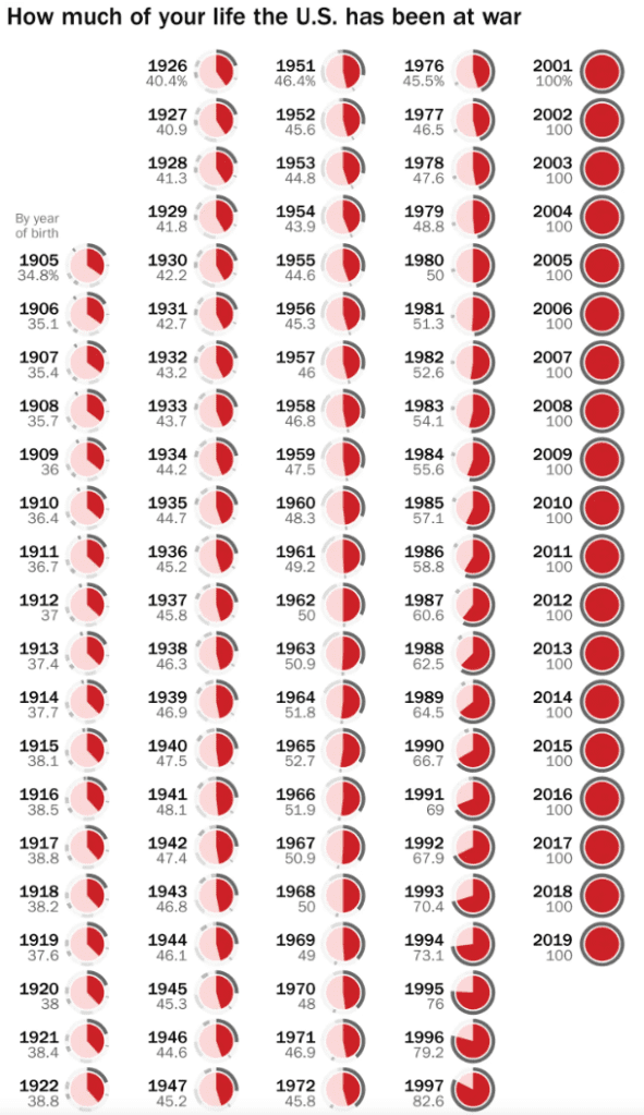
A few weeks ago, someone shared a viz from the Washington Post with me that showed how much of ‘your’ life the US has been at war, depending on someone’s year of birth.
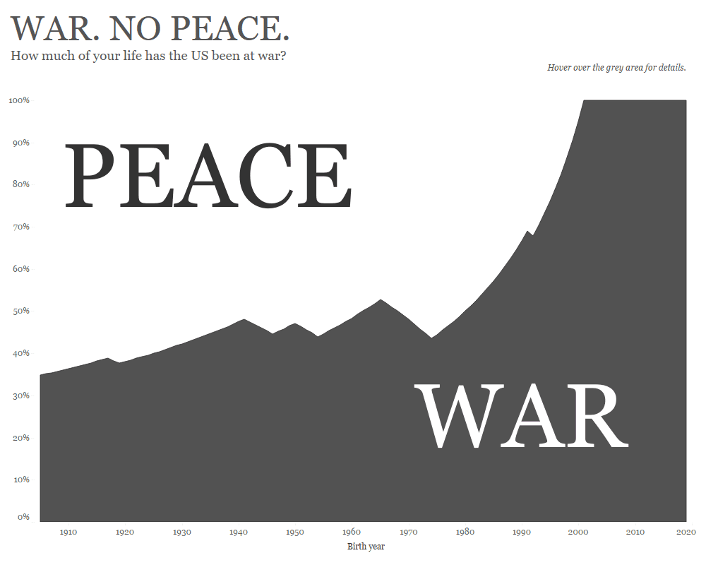
I thought this was a fascinating way to look at the data, so decided to challenge the community to create makeovers of this viz.
Here is the original from the Washington Post:

What works well:
- The small multiples shows how the wars of the recent decades have meant that young Americans have never known their country to not be at war. The gradual growth of the red part of the pie charts shows this pretty well.
- The small indicators for the different wars are a nice addition for extra context and are explained in the article.
- The pies only have two slices – war and total peace – which makes them an acceptable chart type to use.
What could be improved:
- The color choice is a bit surprising. I understand red, but the pink doesn’t really look that great with it.
- I think a z-pattern from left to right, then next row, etc. would be more intuitive to read than going in columns.
- I don’t understand why the first column doesn’t start at the top.
- It’s a bit tall so my eyes have to keep moving down and up to see the changes.
What I did:
- In the interest of time, I kept to a simple viz, keeping with my monochrome theme that I’m currently using.
- To me, the pie charts or small multiples, while being a neat display of the data, don’t show the dramatic change clearly enough that the war in Afghanistan has meant for younger generations, i.e. that 100% of their lives the US has been at war.
- A line shows this more clearly and for extra impact I turned it into an area chart, highlight the times of war and peace.
- This viz needs the interactivity of tooltips for people to see the detail.
- I considered adding annotations for when different wars started, but wanted to keep the stark contrast between war and peace, so decided to keep it simple and clean.


