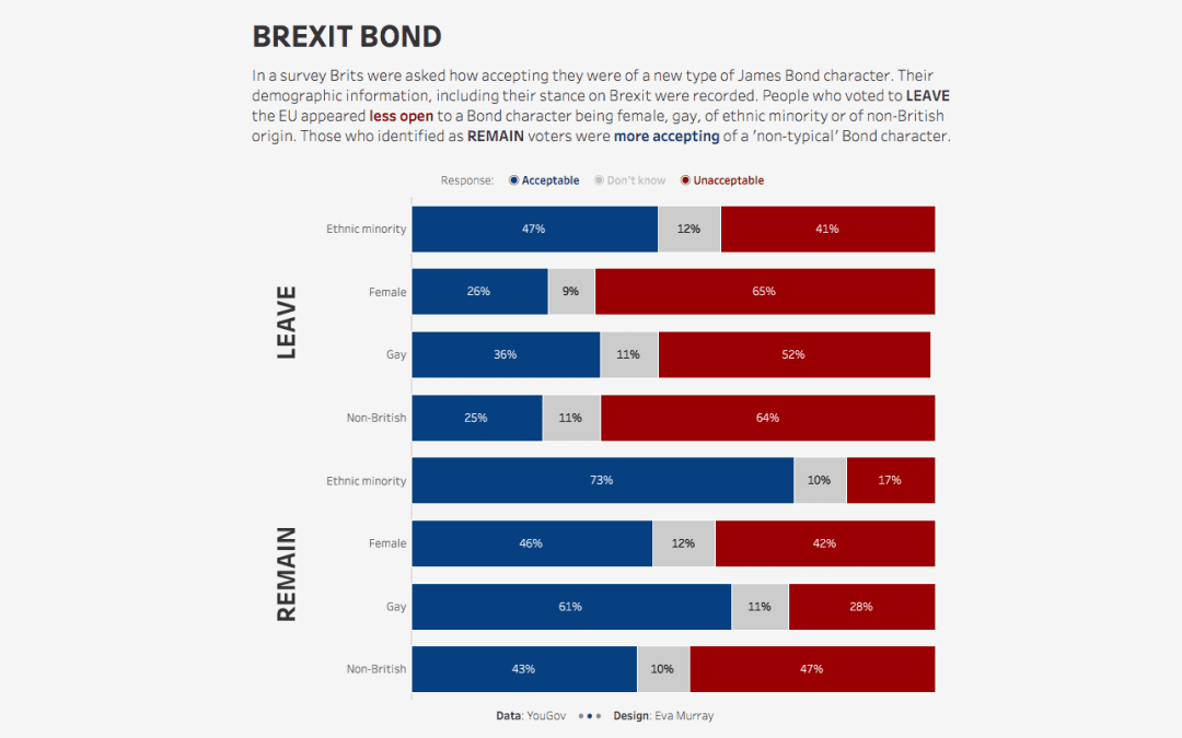
For week 5, Charlie picked an interesting dataset, stemming from a survey of Brits on how they voted in political elections as well as their opinion on James Bond actors and how open they are to a future Bond being female, gay, of ethnic minority origin or non-British.
What a mash-up and I have to say, I am not at all surprised by the results. I know that many people don’t think it’s okay to publicly discuss politics. In Germany your political preferences are definitely a very private matter.
But it’s 2020 and the world is a shit-show in many places, so being quiet isn’t really an option, especially if we want things to improve.
In July I moved to London, the place where most people believe in the value of being part of the EU, an attitude not shared by many non-urban areas of the country. It’s been difficult to understand the apathy with which the topic of Brexit has been handled by many people here, but I also understand that they have grown tired of the constant back and forth over the past 4 years.
Since Saturday the UK is no longer part of the EU. That’s the bit that doesn’t scare me. Yes, it will come with many many inconveniences, but I spent 11 years outside the EU between 2005 and 2016, so I know that’s doable (even if I think it’s an outrageously stupid idea).
What I am scared of are the attitudes of Brexit voters and the shocking levels of racism, misogyny and outrageous mindsets that I have seen here, shared by sensationalist media, but clearly not all that uncommon. Many of those who have made their racist views known are quick to point fingers at Germany’s past, while they are knowingly marching straight into the same kind of mindset that enabled the bleakest part of my country’s history.
So there you have it, yes I am angry and I do not understand how a democratic country like the UK can vote for something that goes so clearly against any progress achieved over the past 70 years. And that is why I am more than delighted with the dataset for this week. Because it gives me a small valve for that frustration.
Here is the original viz.
What works well:
- Survey data is often displayed with stacked bar charts, and this one works fairly well to display the share of opinions amongst those polled.
- Interesting title.
- Subtitle helps understand the chart.
- Sources and survey dates are included.
What could be improved:
- The colours are not intuitive for me.
- The layout is not immediately easy to understand. The subtitle would probably work better if it were closer to the four categories.
- The labelling could be more concise.
- so what? what’s the conclusion from this survey?
What I did:
- The dataset was fairly simple and in the interest of time, I focused on visualizing it in a clear way.
- There didn’t seem a need for any further analysis, the results were pretty self-explanatory.
- I tried to make the statements clearer while also simplifying the description as much as possible.


