I love a good challenge and I also love a meaningful and impactful #MakeoverMonday collaboration.
This week I am in the US and Anya A’Hearn, fellow Tableau Zen Master and dataviz expert, who also leads the San Francisco Bay Area TUG, invited me to run a #MakeoverMonday live session in SFO. This was a collaboration with Bridges for Prosperity, a nonprofit with a great cause. Abbie Noriega from B2P worked with Anya and me in the lead up and provided us with great resources and an interesting dataset for this week’s #MakeoverMonday challenge.
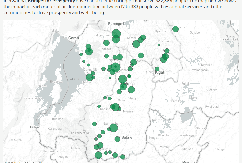
Here is the original viz from their website:
What works well:
- Contextual information provided
- A number of interesting metrics for each country
- Everyone can imagine what a bridge is – so these metrics are fairly accessible, even if you haven’t been to the country shown
What could be improved:
- I found the filters to be actually very unpredictable.
- I have no idea why ‘completed bridges’ would result in a filled map and also why other countries would be shown when I select Rwanda
- The country list is terrible – there is zero logic in the sort order, so it’s almost impossible to find the country you are looking for
- So what? How can I tell whether the progress so far has been good, on target, behind schedule, etc.? How do I see what else needs to be done?
- What about a call to action?
What I did:
- With each collaboration I organize, I have lofty ambitions of creating an ironviz worthy, amazing dashboard. The reality of my role in #MakeoverMonday, however, is that I never have enough time for the viz building, and the real value I add comes more from helping our participants, coordinating with the nonprofits and making sure everything runs smoothly (it feels a bit like what mothers go through when they make sure that everyone else has food and they sit down last to a cold dinner 🙂 ).
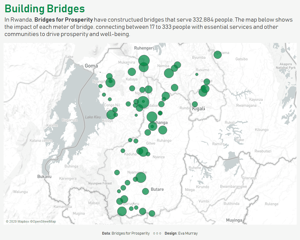
- I opted for something simple, but that helped me to put the numbers into perspective. I wanted to understand how much of an impact each meter of bridge has. Similar to thinking about steps that help me reach the next floor of a building, or the next level in my career, I think of meters of bridges as the building blocks that help these people reach their schools, work places and hospitals.
- So I created a simple map of Rwanda with each bridge location sized by the number of people per bridge meter that have been ‘connected’ through the bridge.
- Click for interactive version


