A few weeks ago I came across a fascinating and terrifying research paper that detailed just how much pesticide use there is in the US, particularly using chemicals that are banned in many other countries because they are deemed unsafe for humans.
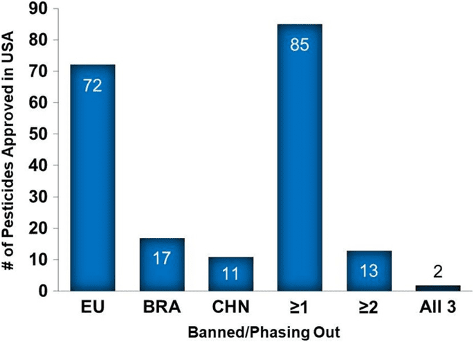
The paper contains a few charts, including this one, which we are making over for this week’s challenge:

What works well:
- It is a simple chart with a single color
- Axis labeling is okay
- Each bar is labeled, which is helpful for knowing the exact number
What could be improved:
- This chart cannot be used as a standalone viz, because without the context of the article, you have no way of understanding it.
- There is no title, there is no description or legend. We can make assumptions about the header of each bar, but knowing that these are countries and a region would be based on those assumptions, not actual information provided.
- The chart doesn’t have the impact it could have because it isn’t telling a clear story about what’s going on.
- The dark blue shading around the bars is unnecessary.
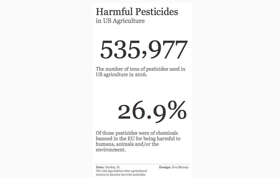
What I did:
- The data for this is pretty terrible, but that isn’t a bad thing, because everyone can learn from working with terrible data.
- When I say terrible, it’s because the categories in the data are not mutually exclusive, while all being shown in the same chart
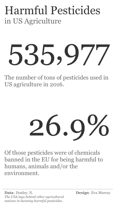
- I went for BANs and text today.
- Click on the image for the Tableau Public version


