For his first dataset, Charlie picked the topic of how popular different American sports are with spectators.
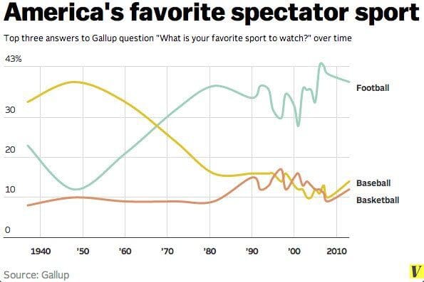
Here is the original viz from Vox.com

What works well:
- A nice and simple chart
- Lines are labeled
- I like the focus on the top 3
- Colors are easy to differentiate
- Should be easy enough for anyone to understand
What could be improved:
- The unit of measurement isn’t that obvious. It would be helpful to have it explained in a sentence that we’re looking at the share of people.
- It would be helpful to explain the squiggle for each sport in the time since the 90s.
What I did:
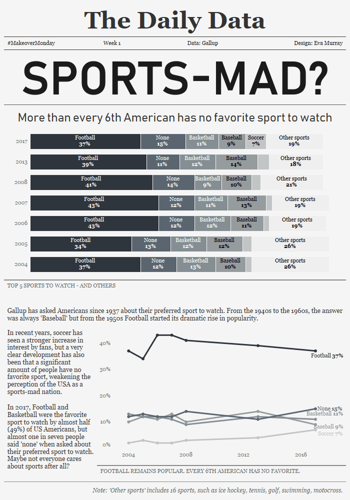
- There wasn’t a lot of data to work with and I actually think the original isn’t too bad, so I decided to try a completely new design.
- Design isn’t my strongest skill, so I turned to Pinterest for some inspiration: I need to see stuff in front of me to be able to use it, rather than just imagining it.
- I think the interesting part about this dataset is that a significant number of people don’t have a favorite sport. So is the sports-mad nation USA maybe not so sports-mad anymore?
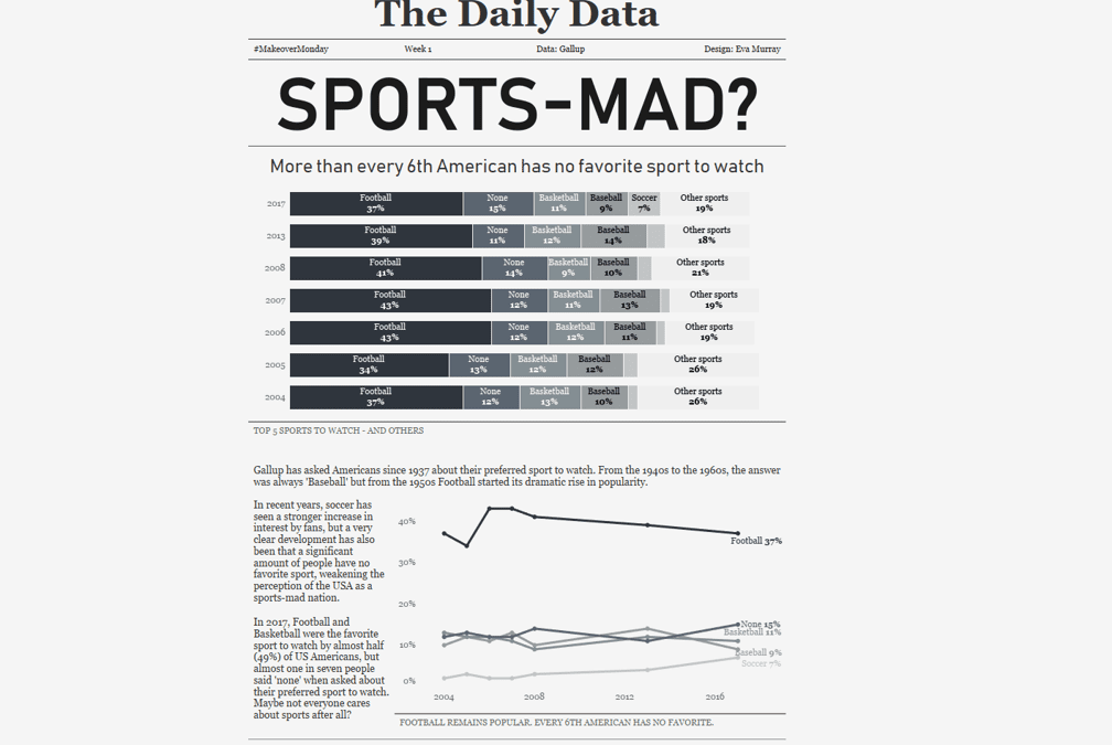
- My viz is intended to read like a newspaper, with some text to explain as well as two charts to show the data.
- Click on the image for the interactive version


