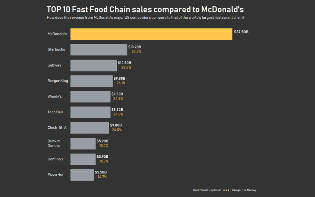
For week 50 of Makeover Monday in 2019, we’re analysing the revenue of America’s biggest fast food chains. Thanks to Andy for finding the viz and the data when all my search efforts resulted in terrible results.
Here is the original viz from Visual Capitalist:
What works well:
- Overall, the design is very eye-catching and grabs my attention. It suits the topic and is instantly recognisable.
- Sources are listed clearly.
- Insights seem to be listed on the ‘receipt’ images.
- Clear and concise title
What could be improved:
- On closer inspection, it is very (extremely) difficult to extract any information, let alone insights, from the viz, except that McDonalds has the highest revenue of the companies listed (biggest french fry) and that Subway has the most chains.
- The rest of the information is lost in the busy-ness of the viz with logos, icons, text.
- There are so many colors and icons, I’m not even sure what to look at.
- Finding the key information, i.e. the revenue earned by the different companies is very difficult and it’s even more difficult to compare the companies, even though that seems to be the purpose of the viz.
What I did:
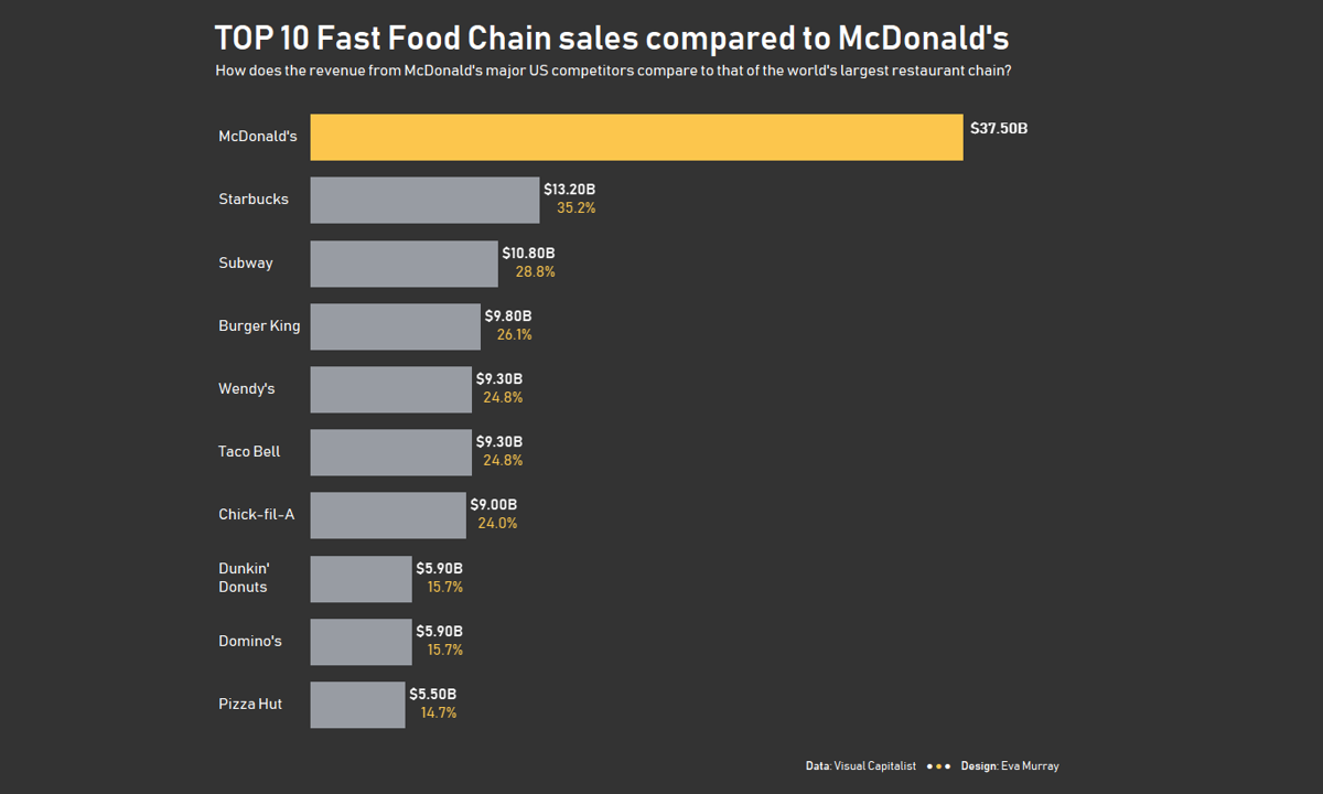
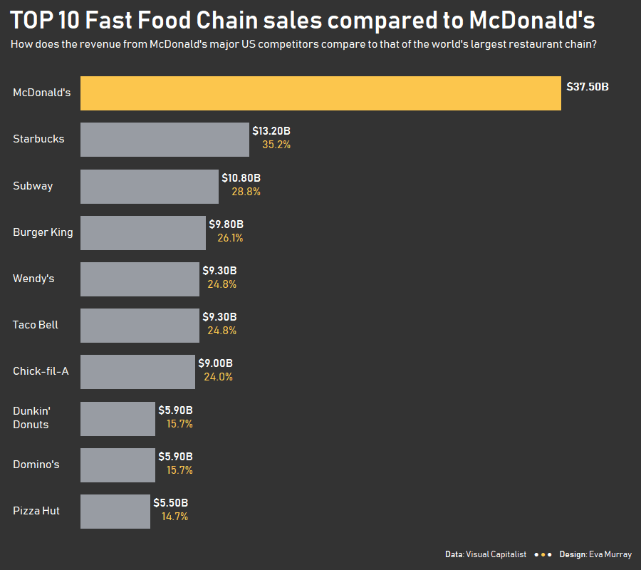
- Focusing on simplicity and a clear message, I opted for a bar chart that highlights the top 10 fast food chains and compares the revenue of the second to tenth ranked chain to McDonald’s who lead the list by a large margin.
- Formatting and labeling was my focus, displaying the percentage of ‘McDonald’s Revenue’ achieved by each of the chains.
- I gave some thought to alignments as well, making the numbers right aligned and the text left aligned, which to me is the most logical approach.
- Here is the viz, click on the picture for the interactive version:


