#data19 has arrived and with it a live #MakeoverMonday session with A LOT of people. We want to use that opportunity of getting everyone in a room with their ideas and skills to tackle a topic that is very relevant today. Literacy and how literacy rates differ across countries, ages and gender.
This live event at #data19 also serves as a preview for our upcoming year-long collaboration with OperationFistula and the monthly Visualize Gender Equality challenges we will run with the team as part of #MakeoverMonday.
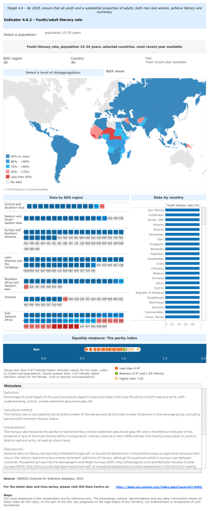
So, let’s have a look at the viz we’re making over at #data19:

What works well:
- The map draws my attention and highlights a few countries that stand out for having very low literacy rates compared to other countries.
- Colors are used consistently.
- Definitions are provided.
- Filters allow me to explore the data further.
What could be improved:
- Overall, this viz isn’t very engaging – it doesn’t have a clear message, statement or call to action to get my attention, so a lot of effort is required from me as the audience to do something with the information provided.
- The viz in tooltips makes navigating across the map difficult, especially when looking at regions like Europe where small countries are covered by the massive tooltip.
- The labeling in the unit chart looks pretty messy.
- The parity index section is very difficult to understand.
What I did:
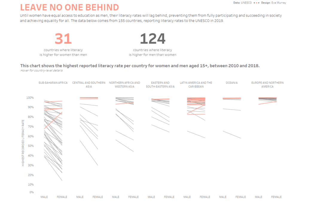
- I wanted to focus my story on the difference in literacy rates between men and women in different countries and regions, because these differences can be very pronounced.
- I chose a simple slope chart and decided to highlight those countries where women are more literate than men.
- Click on the image for the interactive version


