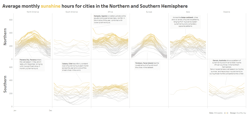

Before winter really takes hold, let’s look at some sunshine hours in cities around the world.
Here is this week’s original:

What works well:
- Captivating visual that makes me curious
- The bar charts at the bottom are nice
- Top 5 lists at the beginning are useful
What could be improved:
- Who is actually able to read, let alone understand quickly the top chart? I am not a huge fan or hiding data, information and facts in artistic charts that are not accessible because of their design
- It’s actually all a bit too colorful for me. What do the colors mean and why are there so many of them?
- Ranking would be easiest done in a bar chart
What I did:
- Having lived in both the Northern and Southern Hemisphere, I always find myself drawn to the difference in latitude and the impact it has on climate and weather.
- So I painstakingly added the missing latitude values for ambiguous cities and then divided them into North and South.
- I decided to annotate my line charts for noteworthy cities.
- Click the image for the interactive version.