What a spectacular weekend in endurance sports: on Saturday morning, Eliud Kipchoge became the first person to run a sub-2 hour marathon, then the Ironman World Championship race in Hawaii saw a double German win with Jan Frodeno taking gold in the men’s race and setting a new course record, while Anne Haug won the women’s race and became the first German woman to win in Hawaii. And then Paula Radcliff’s 16-year old marathon record was beaten in Chicago today by Brigid Kosgei.
Being a triathlete and a big Ironman Hawaii fan myself, I thought, why not challenge our Makeover Monday community to visualise the medal table for the men’s and the women’s race.
Here is the original visualisation from Wikipedia:

What works well:
- Each column can be sorted in ascending or descending order
- The flags give me an instant view of the winning nations
- The time is displayed clearly
- The colouring of the column titles helps
What could be improved:
- While it looks impressive how dominant the US were in the beginning, it’s a bit misleading without knowing the number of athletes (15 US men in race 1) and the number of nations represented. Of course the US dominate if it’s exclusively or predominantly US athletes in the field…
- It’s a table and tables are pretty boring, even if they contain lots of interesting information.
- Who are the dominant athletes overall?
What I did:
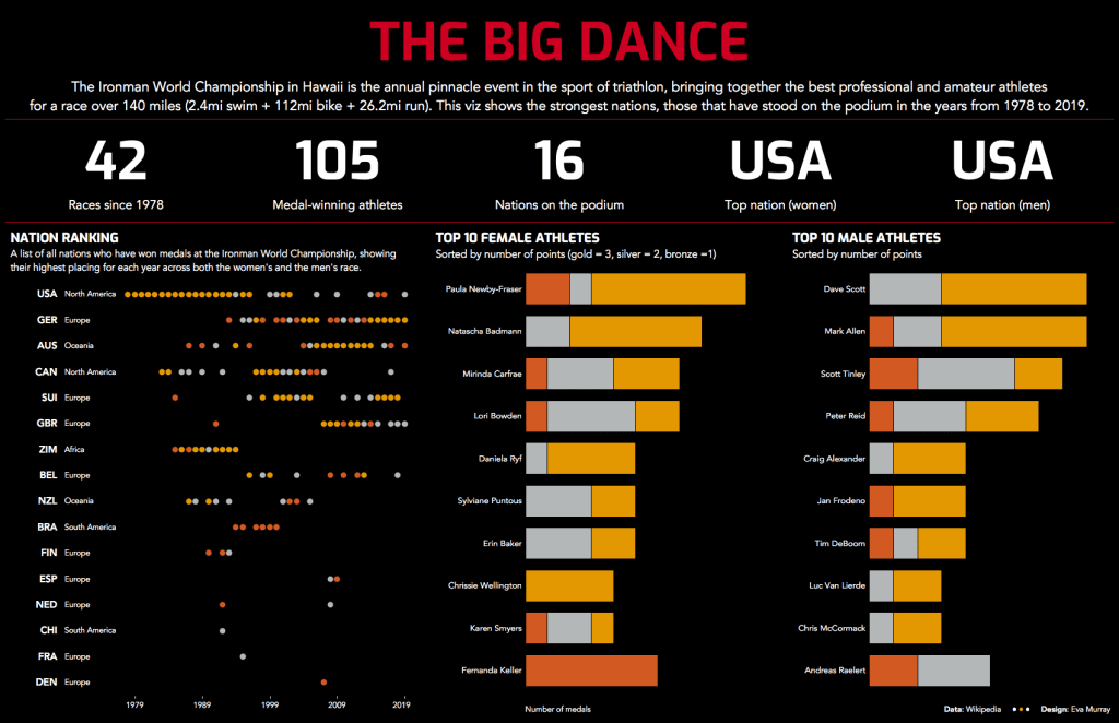
- I decided to stay away from finishing times and durations and instead focused on countries and athletes.
- I wanted to give those who don’t know much about #IMWC an overview of the race and those who are winning it.
- So here is my dashboard (click for the interactive version)

