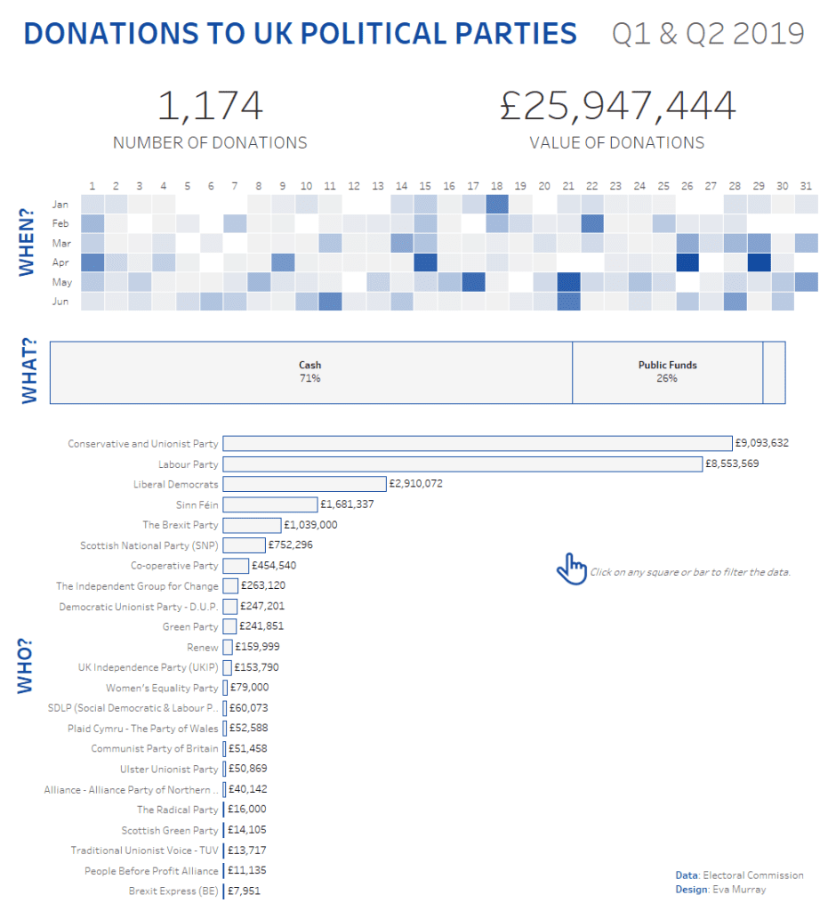
For week 41, Andy chose a dataset about donations accepted by political parties, published by the electoral commission. The visualisation is an interactive Tableau dashboard, but it’s far from best practices and screams for a makeover…
Here is what it looks like:
What works well:
- The small titles for filters and summary figures are helpful
- The y-axis starts at zero
- Political parties are sorted in descending order from those who received the most funding to those who received the least
What could be improved:
- There is no title but this viz definitely needs one.
- The bubbles should be changed to a neat and simple bar chart.
- The colors need to be simplified – multiple parties are represented by the same color and I doubt that – for example – the Green Party would be keen to be shown in the same color as the Brexit Party.
- The bar chart needs to be rotated so that labels can be clearly seen.
- The labels on the bars are confusing. They are not the amount donated but the number of donations – a chart title would make that much clearer.
- The summary figures can be changed to nice large numbers to make them stand out.
- Rather than having a quarterly filter, there could be a timeline where users can dynamically select the period they are interested in.
- So what? What’s the verdict, the conclusion, what does the electoral commission want me to do with this information? And where is the interesting stuff?
What I did:
- The original viz made me want to create a genuine makeover, addressing some of the points I made above.
- Focused on key questions: what, who and when?
- Here is my viz… Click the image for the interactive version

