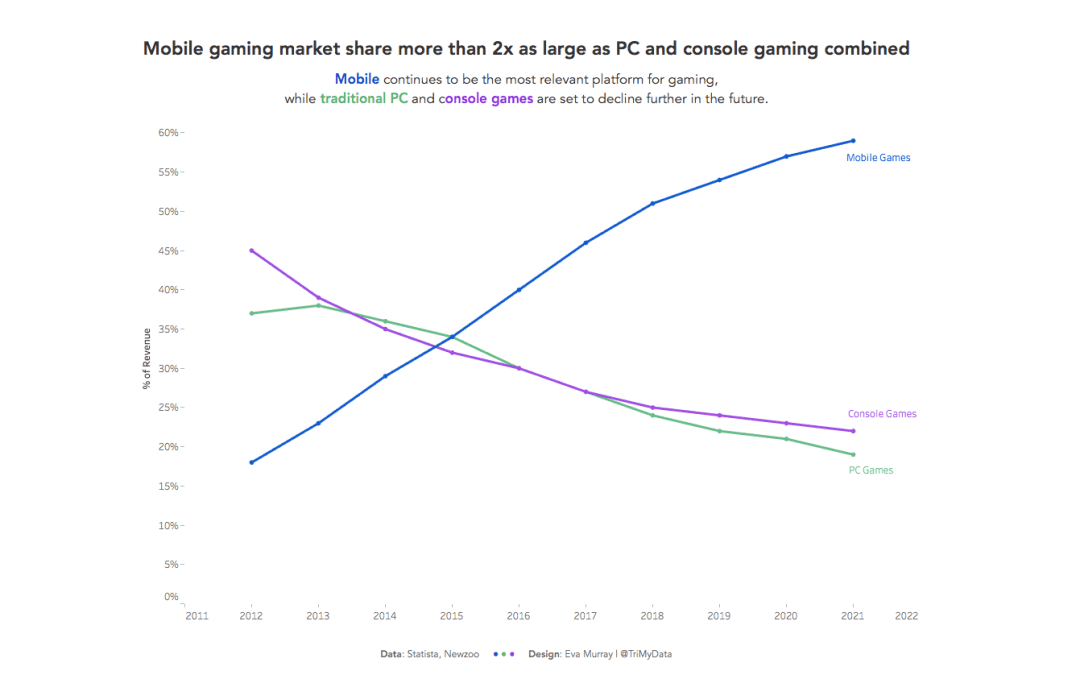
For week 35 Andy picked a dataset about gaming and the shift from PCs and consoles to mobile.
The original visualization looks like this:

What works well:
- Nice distinct colors that are easy to differentiate from one another
- Sorted chronologically
- Title is informative and succinct, while subtitle provides more context
What could be improved:
- What year is this visualization from? The title makes it seem that 2018 was in the future when this viz was created but then the viz itself goes to 2021 – that’s confusing.
- What are some examples of the different games and are there games that can fall into both categories or are they very distinct?
- so what? What’s the impact of these changes?
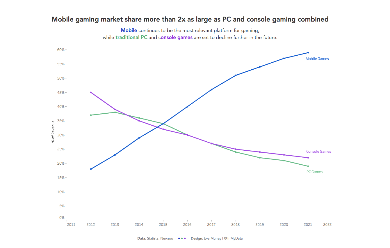
What I did:
- With a small dataset such as this one, there are limited options and after a quick bit of exploring, I settled on a line chart.
- A line chart to me is a great way to represent the change of market share over time in this gaming market as it shows the reversal from traditional PC and console games towards mobile so clearly.
- I stuck to the original colors because I really like the combination.


