By now we all know that the environment and how we treat it is something we can’t ignore any longer and we seriously need to change what we’re doing if we want our children and grand children to have a livable planet.
So for week 32 I chose another environment-related dataset, looking at Britain’s phasing out of coal.
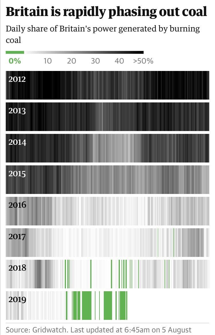
Here is the original visualization from the Guardian.

What works well:
- Very effective viz to communicate the changes over time with a strip plot.
- Great choice of color.
- High level summary included in subtitle and dynamic to change based on the latest data.
- Data source is included with details.
What could be improved:
- I’d love to understand what causes there to still be coal in use in between all those ‘green’ days.
- Also, what’s the impact? Can a figure be included to reference how many emissions were not caused on coal-free days relative to a comparison date?
What I did:
- Initially, purely thinking about a viz style, I planned to create a dot plot, but then rejected the idea, because I needed something fast.
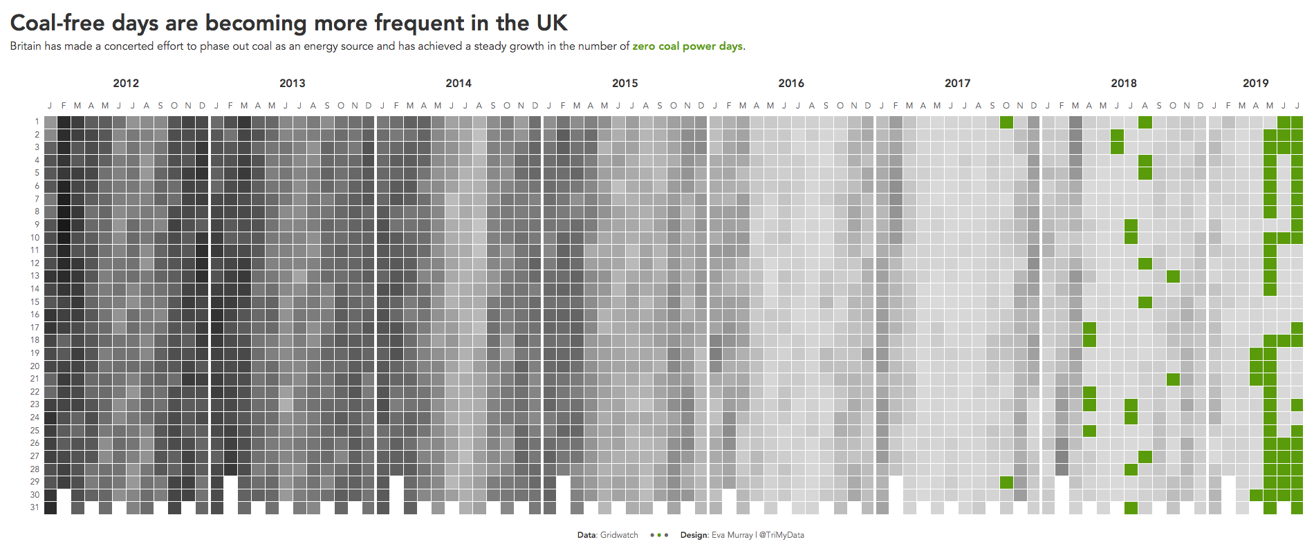
- Enter: My beloved heat map. It never fails me 🙂
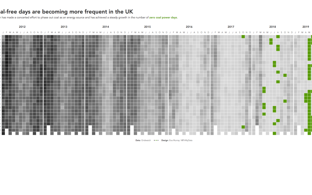
- Here is my viz this week, showing how the number of coal free days are increasing gradually.
- Well done, Britain!


