For week 29, Andy picked a topic that is likely to cause a few people to blush. It’s always interesting to observe what people’s comments are or how reluctant they become to participate when topics are a bit more controversial or – heaven forbid – involved things like sex.
We’re looking at a visualization published in a Washington Post article earlier this year.

What works well:
- The title and subtitle are clear and concise
- The colors work well together, the end points are clearly marked and labeled
- The first and last comparison year are displayed in bold font
- It is simple and easy to understand
- The line charts show the trends clearly that more people are not having sex, more people are having sex only once a month while fewer people are having sex at least once a week
What could be improved:
- Adding a bit more space below the color legend would give the line chart more room and make things look less squished together
- Instead of a separate color legend, the lines could simply be labeled
- I’d like to understand how many people were surveyed and what their ages were
- How are they accounting for cohorts that may have participated in 1989 and now?
What I did:
- As always, I started by exploring the data to understand the different categories. It’s quite intriguing to see those survey responses, even though the survey sample is fairly small.
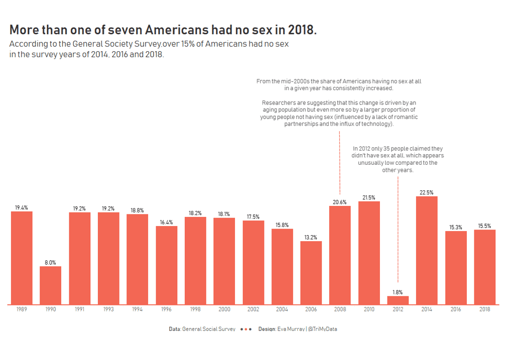
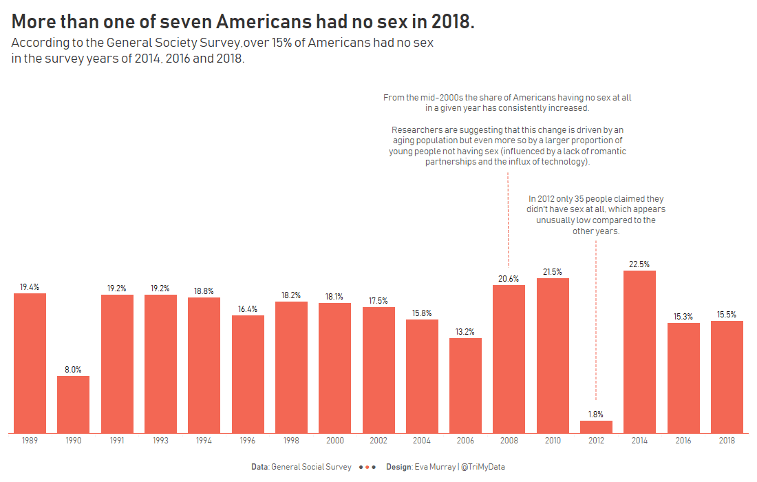
- Without additional data regarding gender and age, I couldn’t find all that much interesting stuff in this dataset, except that people seemed to have more sex in 2012 with a record low of 35 of them responding that they didn’t have any sex that year.
- I stuck to the ‘no sex at all’ story of the original article.
- Here we go:


