This week we’re looking at asylum applications from outside the EU by people seeking protection in EU countries.
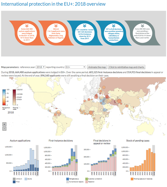
The original viz was published by the European Asylum Support Office based on Eurostat data and looks like this:

What works well:
- The map is interactive which is engaging
- The bar charts are fairly simple
- The main insights are featured in the call outs above the dashboard
- Filters allow users to customize the view
- Data is linked and explained in the article below the dashboard
What could be improved:
- It’s very busy looking with all the colors
- I am missing a clear flow in the dashboard. It would be great to have the individual sections a bit better connected.
- Having the map double encoded with filled countries and colored circles is requiring a lot from the audience.
- The color palette seems very mixed.
What I did:
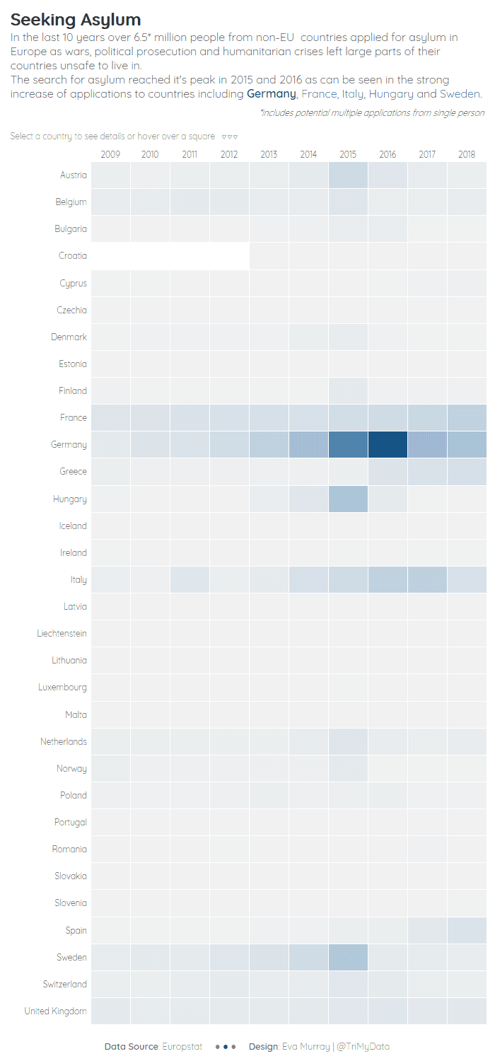
- Focused on total applications at a total level (not broken down by gender) across all destination countries.
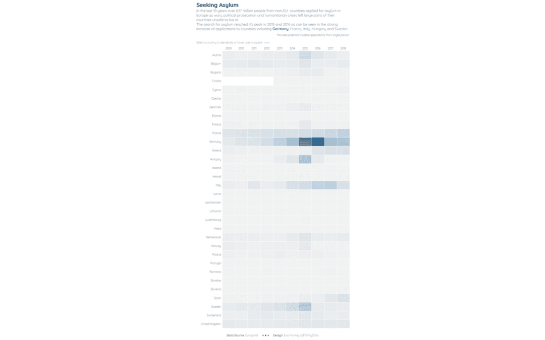
- Chose a heatmap to present the information.
- What I like about the heatmap is that it shows the gradual increase in applications followed by a reduction.
- Used a different font, too.
- Labelling with application numbers appears on selection and is in tooltips.


