Alcohol seems to be involved in every major celebration but equally in a typical Friday afternoon and for #MakeoverMonday in this week we’ll look at alcohol consumption.
Here is the original viz:
.png)
What works well:
- A simple bar chart, sorted in descending order from highest to lowest, listing the top 25 countries.
- Minimal use of color.
- Straight-forward title.
- Useful label of the y-axis
What could be improved:
- A horizontal bar chart would make the country labels much easier to read.
- The description of the metric being used would make for a good subtitle to make it clearer how the countries are being compared.
- The spacing between the bars is too wide.
- The y-axis is truncated. That’s a big no-no as it makes it look as if Belarus has about 3x the consumption of Poland, but the actual values are 17.5 versus 12.5
What I did:
- Having all countries’ consumption measured in pure alcohol is great for comparison purposes but I don’t think pure alcohol is meaningful to the majority of the population.
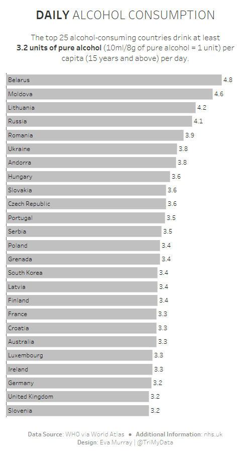
- I chose to convert the alcohol consumption metric from the original into standard units of alcohol per day to make the numbers more relatable.
- Swapped the view into a horizontal bar chart for easier reading.
- Added a short description in the subtitle.


