
We’re continuing to tackle important topics with #MakeoverMonday and I really enjoy it. I’ve noticed the community putting in the extra effort when a dataset ‘matters’ from a societal, political, environmental or ethical perspective.
So for this week we’re looking at the topic of sleep. It’s something I care greatly about but I certainly don’t always get enough.
I have a routine that sets me up for sleep success, but when I’m stressed, those resolutions suffer and the quality of my sleep deteriorates. Ironically, the stress is typically self-inflicted because of my perfectionist tendencies and because I worry too much about stuff.
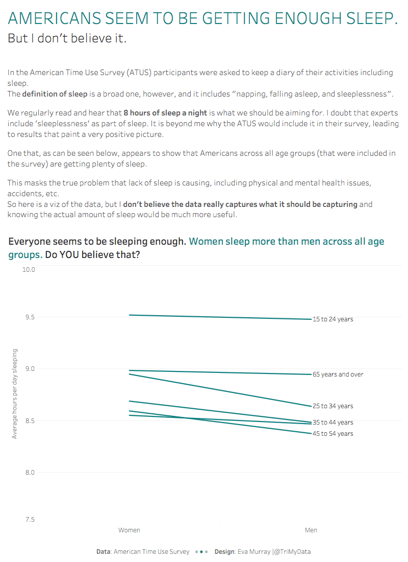
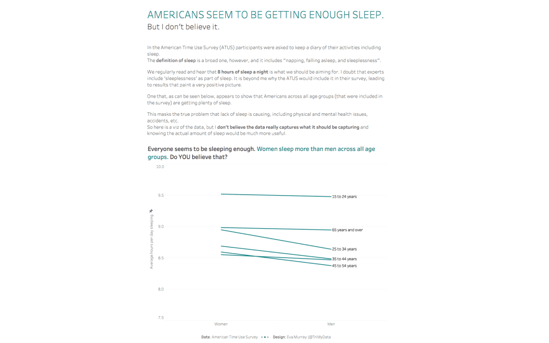
This week’s viz comes from the American Time Use Survey:

What works well:
- Colors are distinct but not gender stereotypical
- Sorting the bars by age group
- Title is ok
- Source is included
What could be improved:
- a lot…
- The title is boring and could be much more informative
- The bars are truncated, exaggerating the difference between average hours of sleep (e.g. 8.2 hours look like they’re about half as much as 9.8 hours)
- The bevel effect is unnecessary
- The age group labels are very close together, adding a line break would make them more legible
- It seems that they used a broad definition of sleep, including phases of insomnia, snoozing, day dreaming and trying to fall asleep – I think it’s important to note that in the viz as well, because these numbers look so much higher than what we typically see reported
What I did:
- I don’t believe the data. Their definition of sleep is something I cannot agree with and it completely distorts the picture of how much sleep people are getting – or not getting.
- So my viz this week focuses on that: me disagreeing with this survey which I find simply stupid.