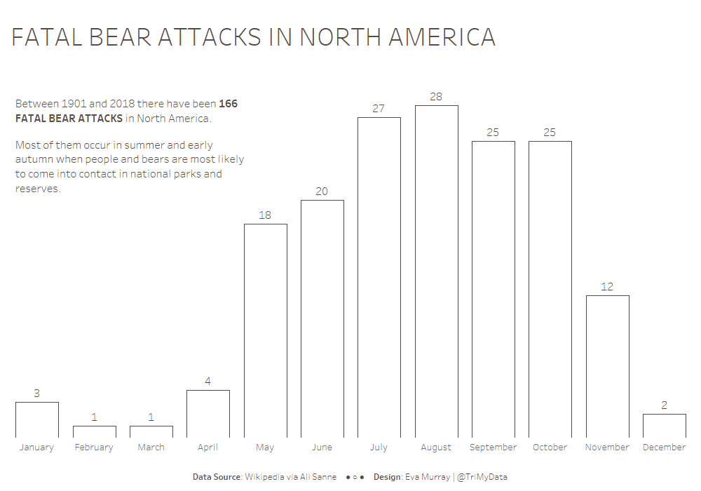
For this week Andy chose a dataset about bear attacks that ended fatally. The original viz comes from Vox:

What works well:
- Nice simple viz
- Bar chart is easy to read
- Showing clearly the months when no fatalities occured
- Clear title and subtitle
What could be improved:
- The bear icon distract my eyes a bit from the number labels
- I’m not sold on the orange color
What I did:
- A minimalist bar chart this week as I’m seriously short on time at the moment

