After a few weeks of more in-depth datasets I decided to use a dataset that was shorter and simpler, with the option for people to add more context should they wish to do so.
This week we’re looking at rhino poaching in South Africa and the original viz looks like this:

What works well:
- Good color choices
- The large rhino image helps to illustrate the topic
- Data is sorted in chronological order
- The WWF logo helps give credibility to the viz and indicates the author
- Clear and concise title and subtitle
What could be improved:
- In my opinion, a unit chart doesn’t work at all here. One rhino seems to mean 36 animals or 13 animals poached, judging by the first two years in the viz. However, 3 rhinos in 2008 represent 83 rhinos poached, so that would be almost 28 rhinos represented by a single icon.
The range from 13-36 rhinos per icon is pretty large… and there is no legend to specify how many rhinos are represented by one icon - The icons for me take the seriousness out of the message. We see little animals stacked, but the severity of the situation isn’t reflected by that
- It would be great to have some annotations that explain the increase and recent (slight) decline in poaching number
What I did:
- Something simple and quick as time is of very short supply at the moment
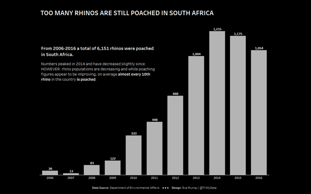
- A bar chart and an annotation based on the article


