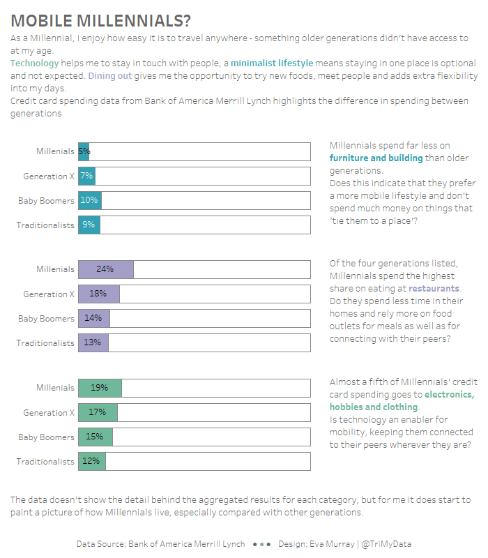
For week 13 we are using a viz about consumer spending by generation, using data that indicates what people spend their money on and how it differs depending on how old they are.
What works well:
- A stacked bar chart that goes to 100% makes it easier to compare the different categories
- Sorting the generations from youngest to oldest in ascending order
- The color legend is sorted the same way as the bars
What could be improved:
- There is too much color, so nothing really stands out and the chart looks quite noisy
- There is no information contained in the chart that indicates what the insights are, what the data means.
- The gridlines are unnecessary
- The labels don’t need to include a decimal point, whole numbers would be sufficient
What I focused on:
- I’ll admit to feeling very uninspired this week. What more to do than a bar chart?
- I’m on the road again, traveling, so I needed to build something simple and fairly quick
- I decided to bring in my own opinion as the data reflects how I spend my money and I connected that to my lifestyle which is pretty mobile, being here there and everywhere, spending little on things and more on experiences.

